Brunswick Cue Decals Through Time
My goal has always been to restore billiard cues to their original look and condition. Thus, early on as I restored vintage cues it was necessary to address the need to replace badly damaged or missing Brunswick cue decals with a decal that was correct in every regard. I also reasoned that knowing when Brunswick changed from one decal design to another could also be useful in dating antique billiard cues. Unfortunately, from my research thus far, I have found that there is little literary information available that address how the billiard cue decal design evolved. Furthermore, information that has been published by one source or the other is of differing opinions
For example, the Blue Book of Pool Cues third edition page 189, gives specific dates when the early Brunswick billiard cue decals were in use. This publication says the eagle decal with the white outer ring was only in use from late 1800’s to early 1900’s. The eagle decal with the red outer ring is indicated to be in use from 1906 – 1920. Blue Book of Pool Cues publication also indicates from 1921 – 1925 an eagle decal with a gold outer ring and red field was used. And from 1926 – 1939 this same eagle decal had a green outer ring with either a red or yellow field. This Blue Book information is not consistent with the Billiard Encyclopedia, Third Edition bound book. On page 194 the Billiard Encyclopedia indicates the eagle decal with the red outer ring was introduced in 1912 and rather than 1906 as indicated by the Blue Book.
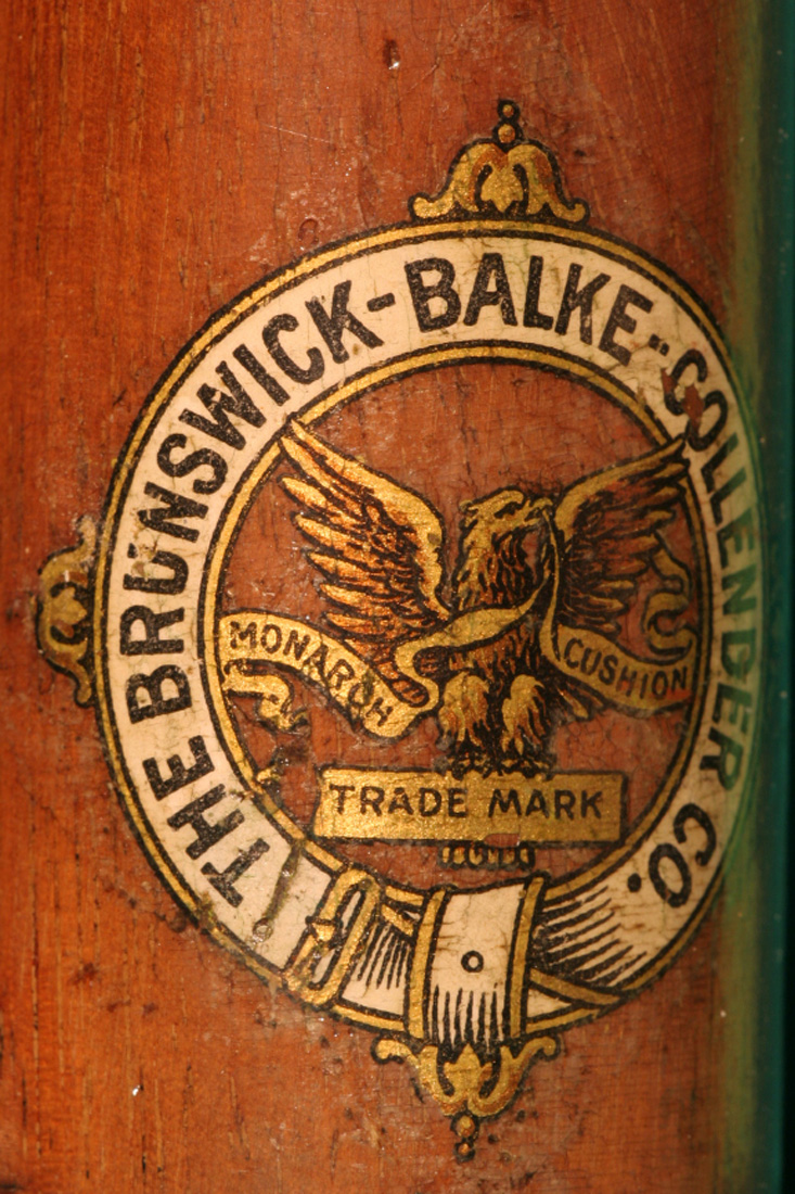
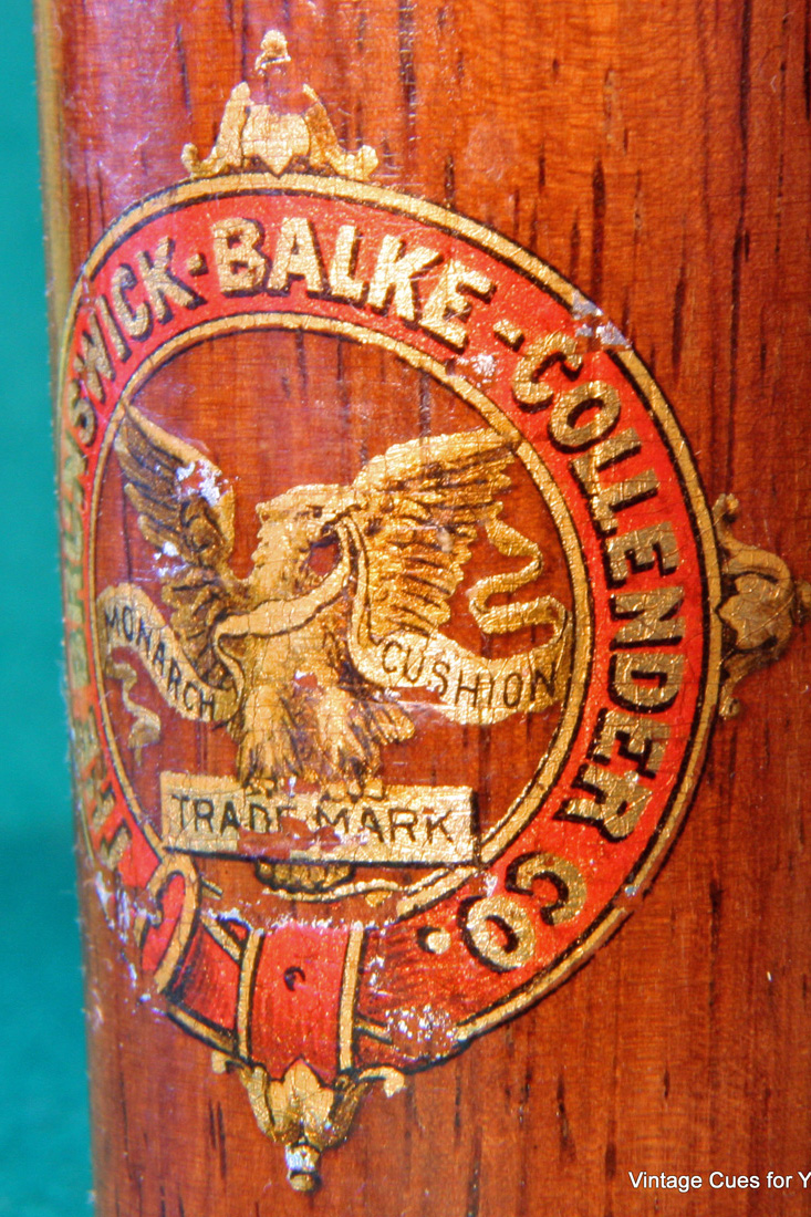
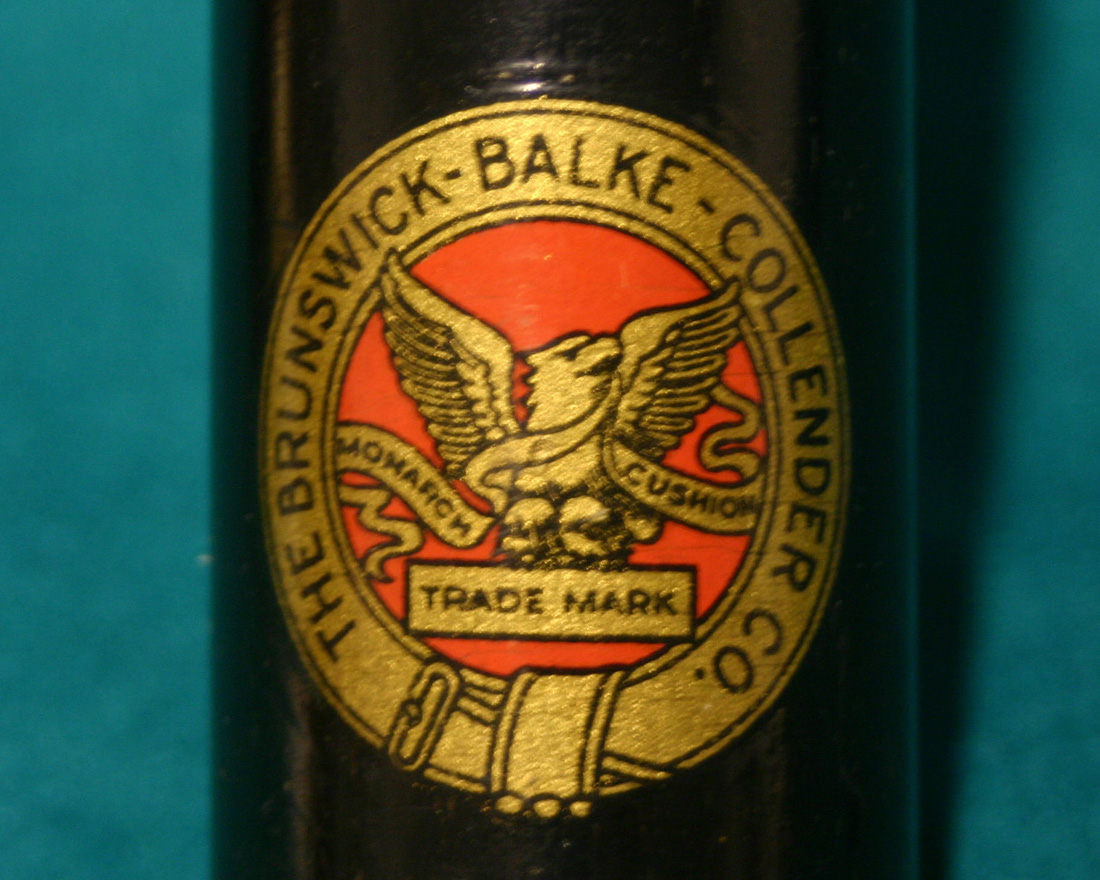
I have less than a complete collection of Brunswick Supply Catalogs, but from those that I do have I noted the following regarding the dating of cues by their decals. The 1908 Brunswick Supply Catalog has pictures of billiard cues but none are shown to have decals. The two early white and red decals are both distinctive in that at the 12, 3, 6 and 9 o’clock positions around the outer ring there is what appears to be a decorative bell like feature that is not seen on the later Brunswick decals. See the white and red Brunswick-Balke-Collender Co. decals at the top of this page.
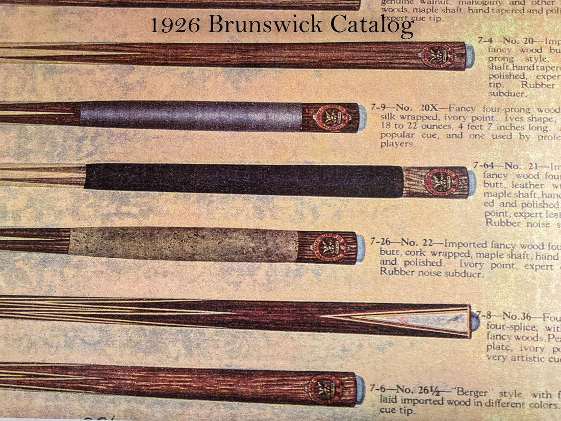
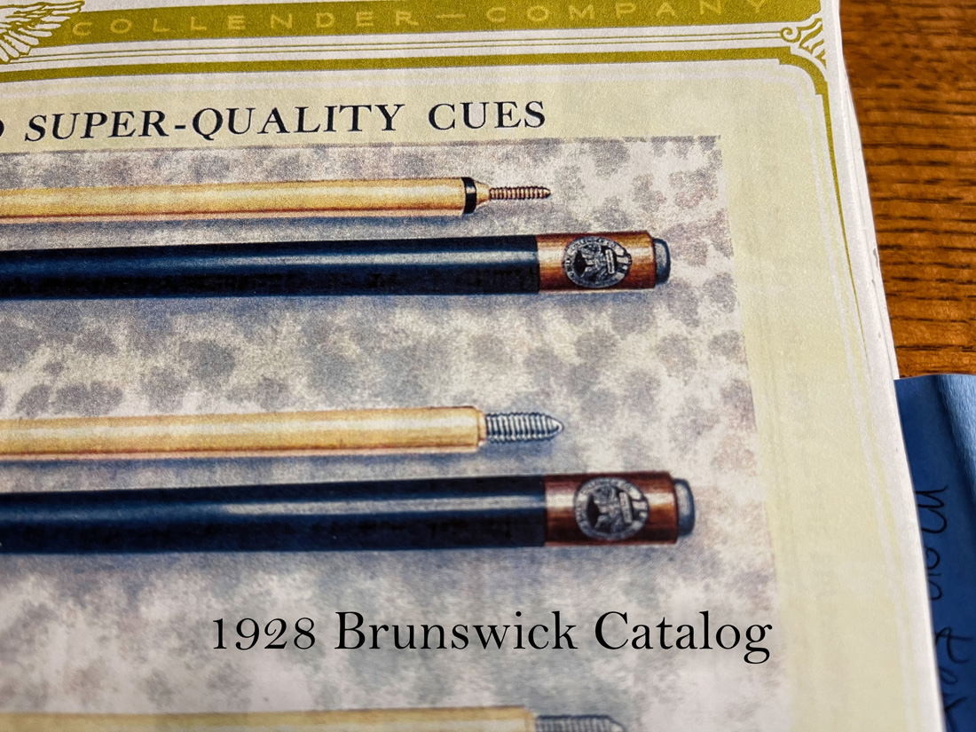
In the 1912 color Brunswick Supply Catalog there are cues with both the white or the red decal with the bell like outer design. If the Blue Book of Pool Cues was correct one should only see the red ringed decal in the 1912 book. The 1915 Brunswick catalog with a color foldout shows only white decals. Here are a few of the other catalogs that I have and the color of the decal shown: 1917 – white; 1924 – white; 1926 – red. In 1928 the color Brunswick Supply Catalog for the first time, that I can find, shows a Brunswick cue with a decal without the decorative outer bell design. This 1928 color catalog shows the outer ring to be white, which I have yet to see on a Brunswick cue.
I have not been able to find credible evidence as to specific years when Brunswick changed cue production from one cue decal to another. I suspect there was no across the board change in the cue decal in a given year. It is likely that more than one type of cue decal may have been used in the same year so one must be careful to not use the decal to date-specific a Brunswick Cue.
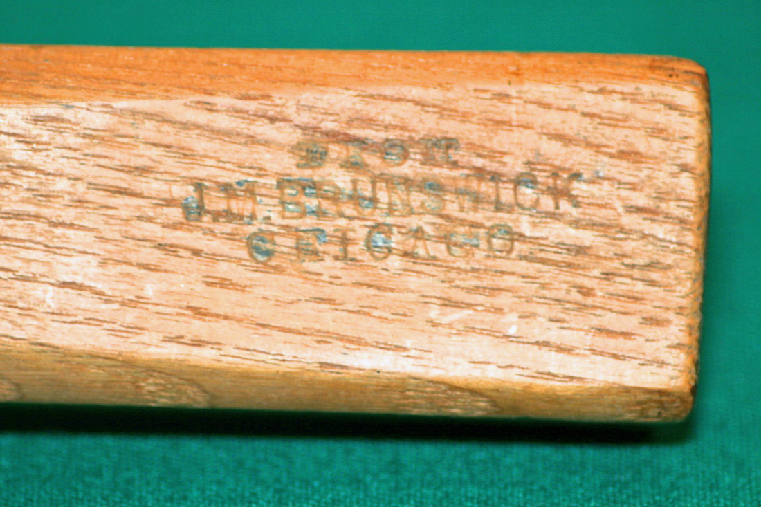
Without being specific as to the date when Brunswick made a change from one style of decal to another, here is what we do know with some certainty. The very first Brunswick billiard cues that identified the manufacturer had a pressed stamp rather than a decal. In pictures #1 and #2 below you will see the cues are stamp J.M. Brunswick Chicago and H.W. Collender CO. N.Y. The cue in Picture #1 can more easily be given a date range when produced since it was before the J.M Brunswick merged with Julius Balke in 1873 to become J.M. Brunswick and Balke. The cue in Picture #2 was manufactured some time before 1884 as this is when H.W. Collender merged with the other two companies to form the Brunswick-Balke-Collender Company. I do not have an example of a billiard cue with a pressed stamp J.M. Brunswick and Balke or Brunswick-Balke-Collender Company but they likely exist. If you have such a cue, please send me a picture and I will update this section of the website.
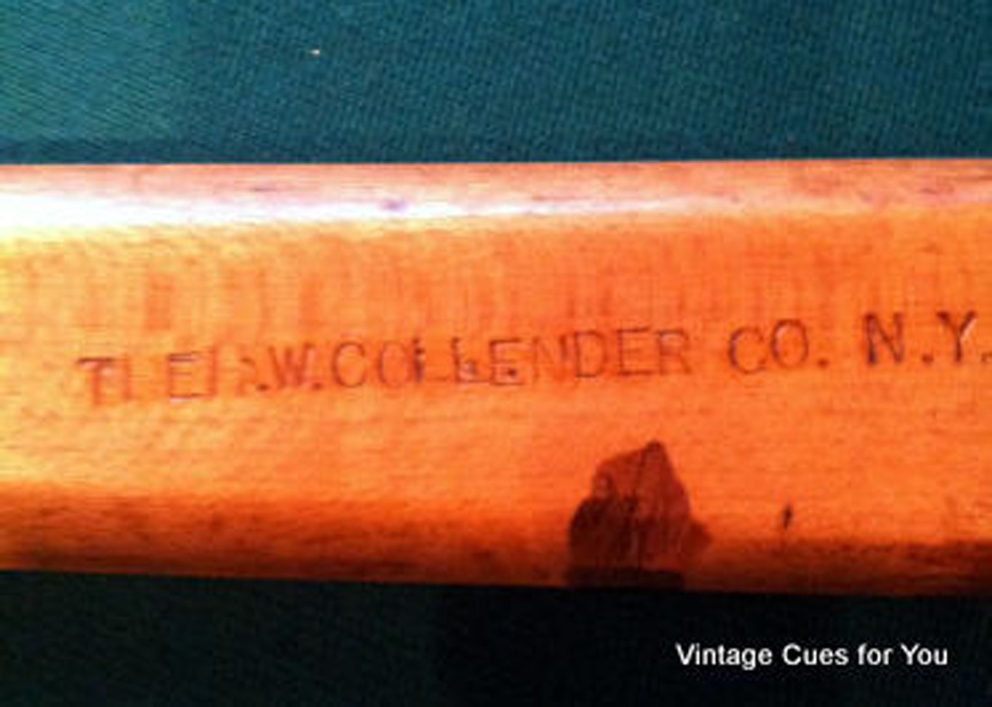
At some point in the late 1800’s or early 1900’s the Brunswick cue went from pressed stamp identification on the cue to a cue identified with a decal. All of the decals used by Brunswick up through the round eagle decals in the late 1930’s were a silk screen lacquer decal printed on duplex paper and adhered to the cue with a thin layer of varnish. It is easy to recognize an old unapplied varnish fix decal as the image that you see when you look at the decal is from the back side. The application of a varnish fix decal is a bit more difficult to apply but if one is to accurately restore a cue you must use a varnish fix decal on these early Brunswick cues. To learn more about varnish fix decals go to the Cue Decal Recreations section of this website.
I think most believe there is one eagle decal for both the white ringed eagle decal and the red ringed eagle decal. SUCH IS NOT THE CASE. If you had looked at as many of the original eagle decals as I have in the past 20 years, you would see dramatic differences in the white and red decals and in fact Brunswick used variations of each of its decals. I often wonder why Brunswick chose to modify the art work for say the white or red decal during its years of use. Perhaps Brunswick changed suppliers for these decals, and in fact the new decal manufacturer modified the decal slightly because they did not have access to the original art work. Whatever the reason, if we could only know when these modifications in design were done, then perhaps we could more correctly determine the age of a particular cue.
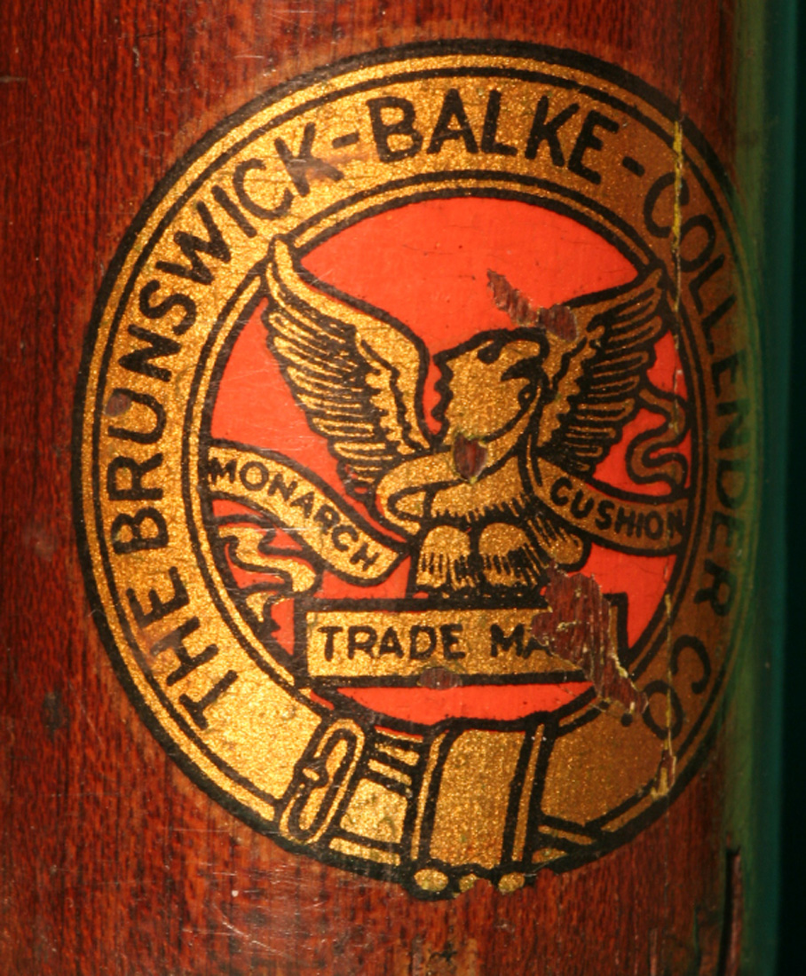
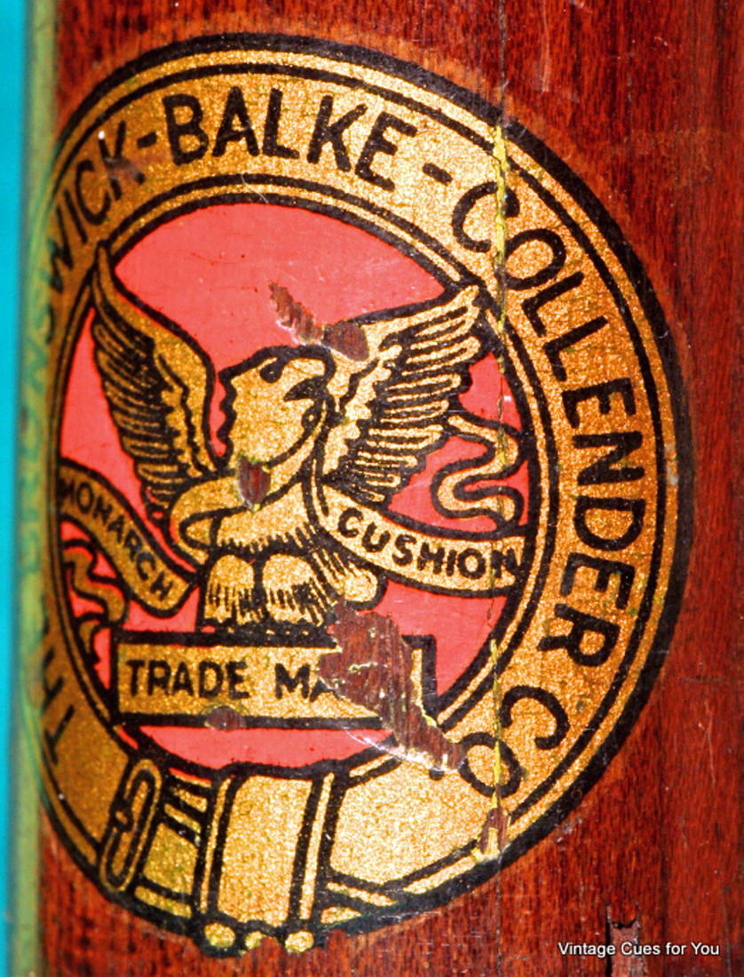
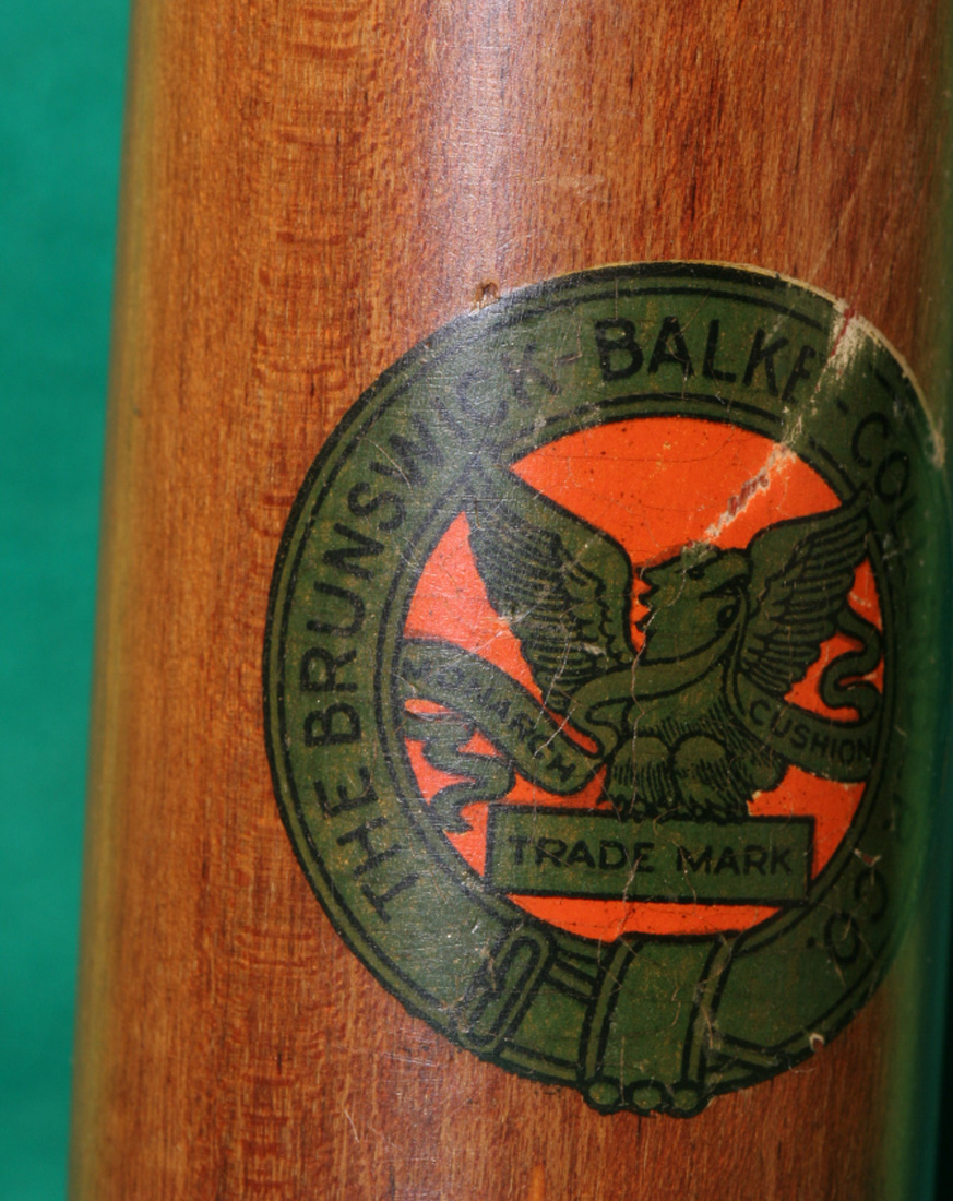
The first Brunswick decal appeared on cues around 1910 as noted in old Brunswick catalogs and is likely the one shown in Picture #3 and #4 below. These two pictures are two views of the same decal so that you can see the detail around the cue. The focal point of the decal is a gold eagle holding a “monarch cushion” banner. It is bordered with a white ring with the “The Brunswick-Balke-Collender CO.” name in bold print. Note, the bell like feature at the 12, 3, 6, 9, clock positions around the outer ring. Also note, the brown swirl in the bell and the tinting in the eagle’s wing. Pay particular attention to the vibrant gold ink used in both the white and red eagle decals. With gold prices fixed, many printers in the early 1900s actually used gold dust in the lacquer inks in the silk screen process. As gold prices began to rise printers went to other pigments rather than gold dust in the ink. These new inks did not hold the bright gold look and instead took on a dingy green cast over time which is prevalent in most of the eagle decals with red wings.
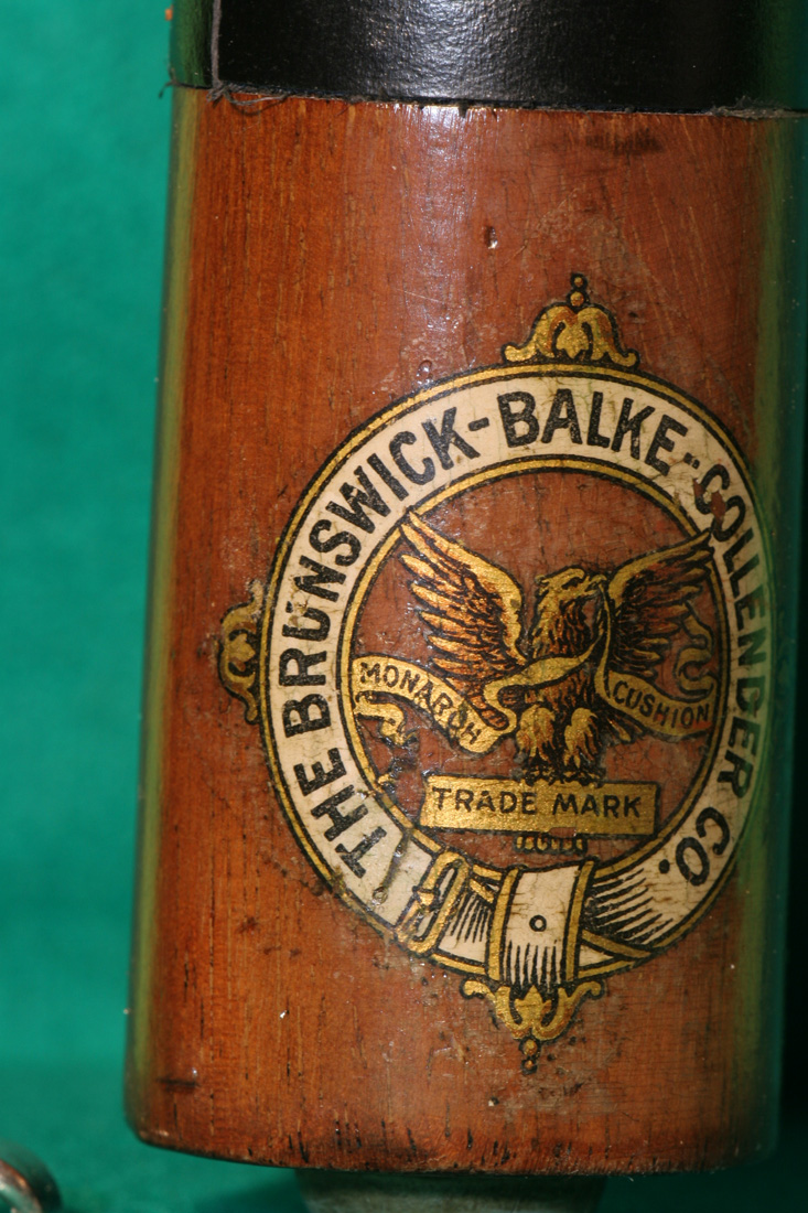
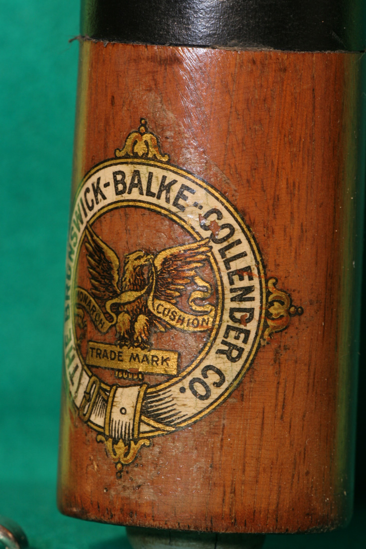
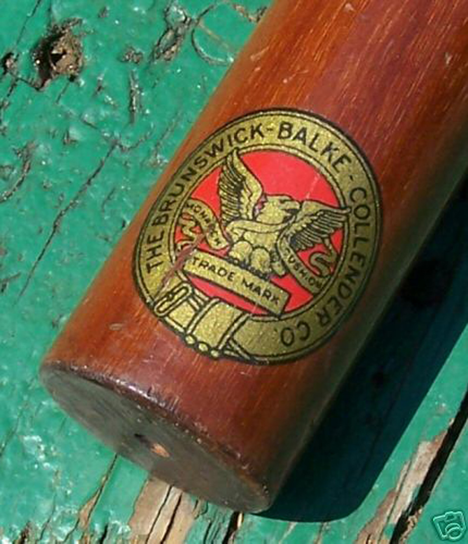
Picture # 5 below is an original decal from a Brunswick Fish Pole. This decal has slight differences from the decals in Pictures #3 and #4 above. Notice the banner, streaming below the “monarch” side in the decals in Pictures #3 and #4. It is thicker and the banner touches the inner circle. Compare the above banner to the one in picture #5 and you will see the Fish Pole decal streaming banner is thinner and its tail does not touch the circle. Also look at the neck of the eagle in the decal in picture #3 & #4. The neck is thicker than on the eagle in Picture #5. These differences in decal design are small but very noticeable if you begin to study the decals in detail. The differences could also help to put cues in approximate date order if there were records or catalogs that show when Brunswick used particular decals. I suspect the decal in picture #5 is the second decal design used by Brunswick on their early 1900’s cues based on when the Fish Pole cue was first introduced. These Brunswick decal design details are critical if one is to recreate reasonably correct decals for cue restoration projects. All of the decals that I sell on this website are computer generated, extremely correct in both detail and color. See, Cue Decals for Sale.
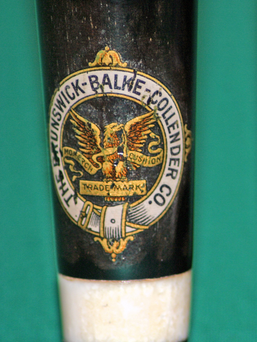
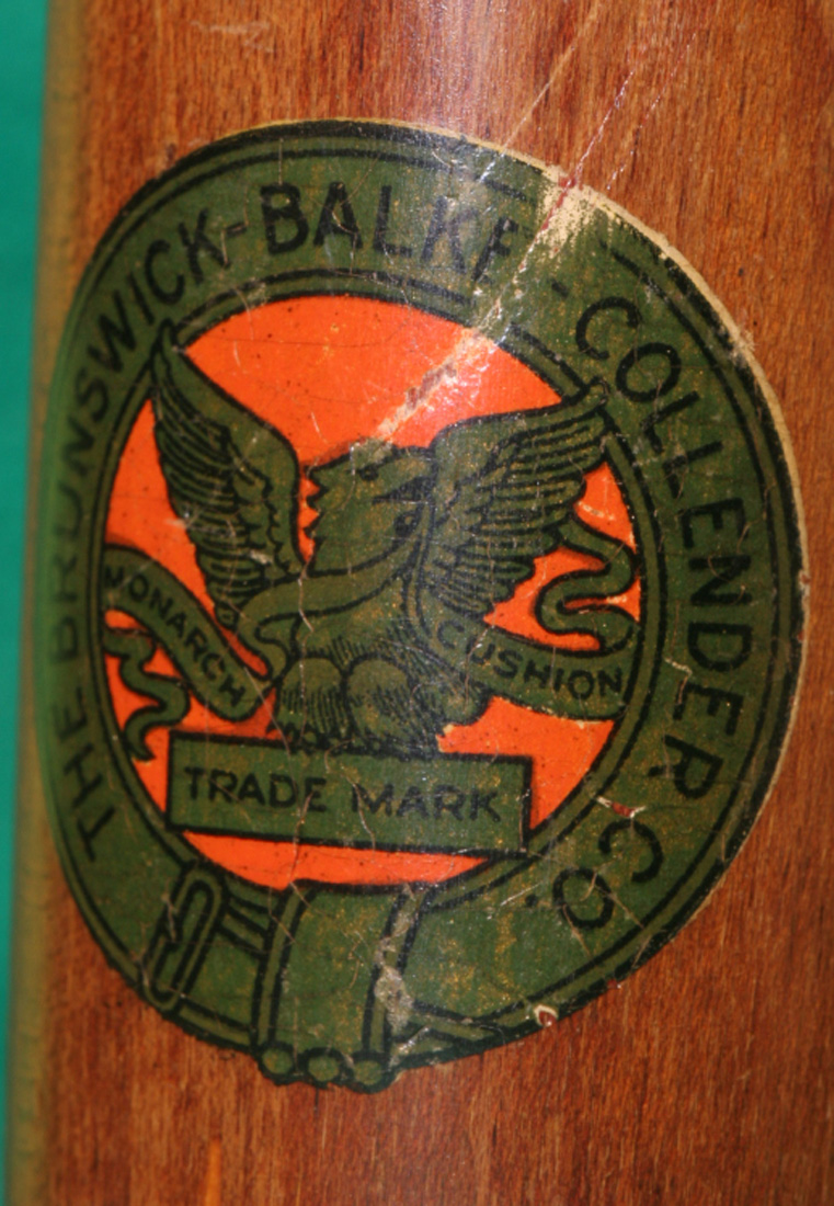
The two views of the decal in picture #6 and #7 are what I believe to be the first of the red eagle decals. The reason being is the eagle in the decal in picture #6 & #7 is thinner in its neck area and more closely resembles the eagle in picture #5. There are noticeable differences from the earlier white ringed eagle decals shown above. For example, the eagle has 6 tail feathers in the white decals above while this red ringed eagle in picture #6 & #7 has one rounded tail feather. The left wing of the eagle below disappears into the outer ring while its wing tip shows in the white decal. The balls at the top of the outer bell are larger in the red decal (Picture #6) as compared to the white decal (Picture # 4). Examine what looks like a belt buckle at the bottom of this red decal in Picture #6. It is more rounded in shape than the ones in the white decal in pictures #3 & #5. This eagle in pictures #6 & #7 has a mean looking beak unlike any other of the decals. While there are many other differences, I could call your attention to, I leave you with one last observation – note the black lettering in the “The Brunswick-Balke- Collender Co.” in the white ringed decal, picture #3, as compared to the gold print in the lettering of the red decal in Picture #6. This noticeable difference has apparently been overlooked on all replacement decals on the market except mine.
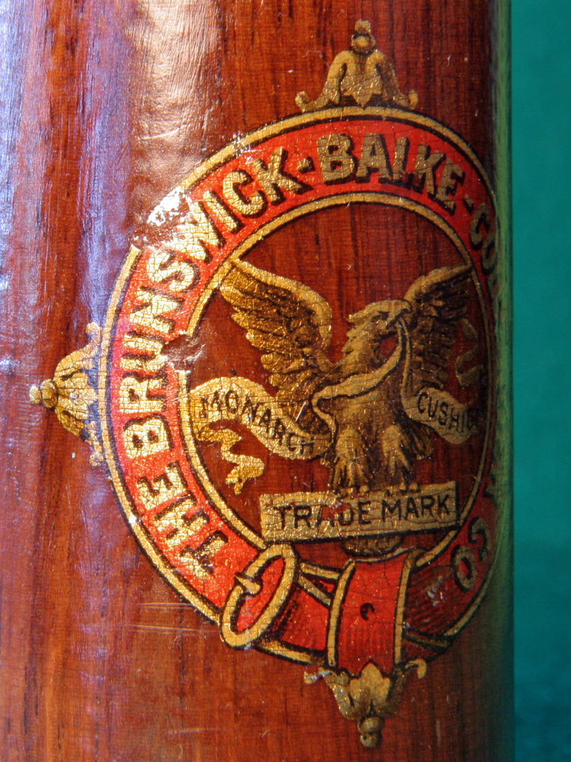
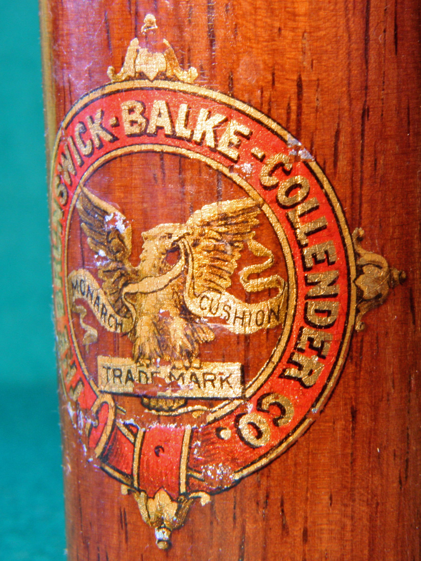
The two views of the red ringed eagle decal in Pictures #8 and #9 below are quite different than the one in Picture #7 above or the white ringed eagle in picture #3. Compare tail feathers in the eagle in Picture #8 to those above. These tail feathers are jagged and point to the left. Look at the very bottom of the outer red ring – there are 9 black streaks in the lower center part of the ribbon on the ring in Picture #8 while only 6 black streaks in banner in Picture #6. Look at the thickness of the eagle’s neck in Picture #8. You cannot see the wood of the cue showing below the beak in this eagle while you can in all the previous eagle decals shown above. There are several more differences between the eagle shown in Picture # 8 and # 9 when compared to the others. Can you find them?
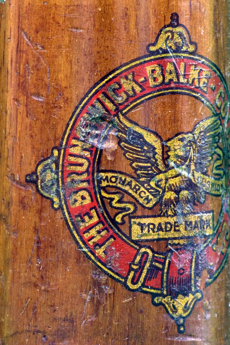
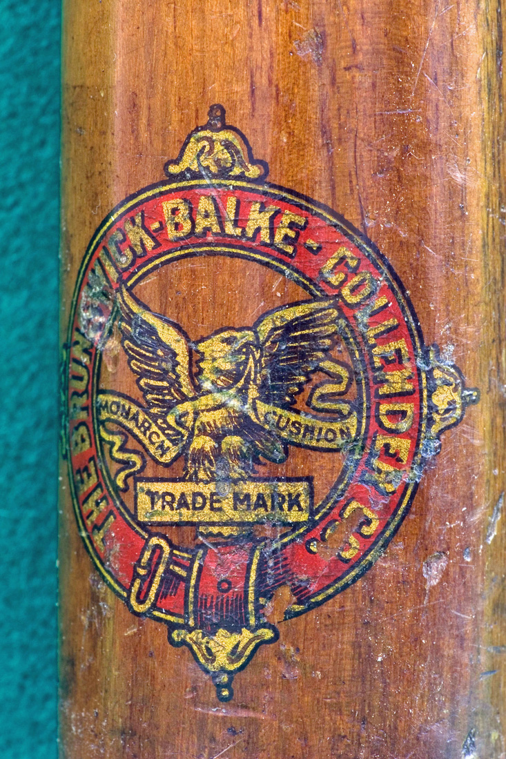
The two views of the red decal shown in Pictures #10 and #11 are yet again different from the red decals shown above. For example, note the black shadowing below the letter “B” in Balke in the upper outer ring in the decal in Picture # 10. It is missing below the letter “B” Picture #9. All of the lettering and shadowing are different in these two decals. I call your attention to the green tint in the eagle in the #10 decal as compared to the prior gold eagles – most notable is Picture #7. This greening effect is a good indication that the cue in Picture #10 is not as old as the one in Picture #7 since the silk screen printer at the later time has gone from gold dust in the ink to a not-so-good gold ink substitute that has discolored over time.
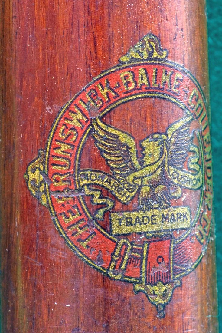
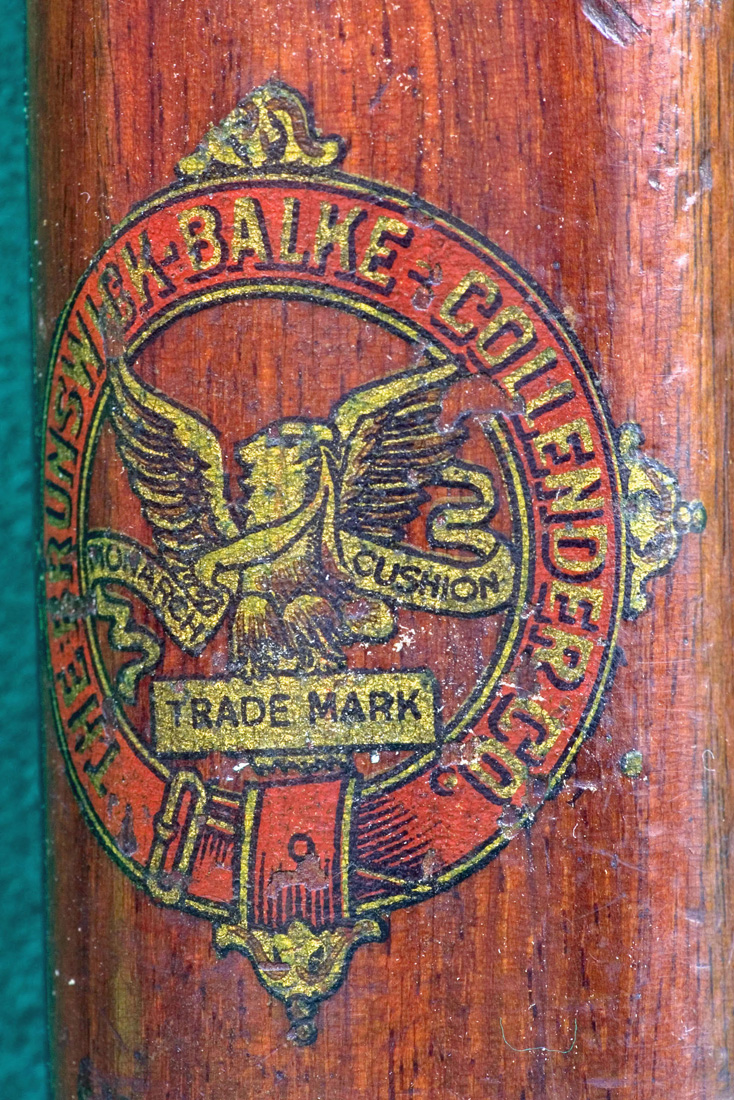
Picture # 12 is an original decal on a Brunswick Valcanite cue. You can clearly see how the gold ink in this cue has changed to a green cast which indicates this cue is not as old as a cue with a bright gold looking decal that incorporated gold dust in the silk screening ink.
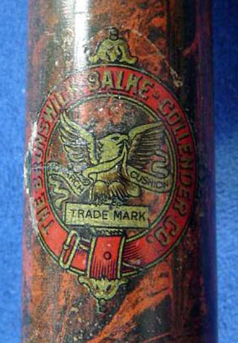
Look at the decal in picture #13. This is a very distinctive tail feather from any other decals that I have seen on antique Brunswick-Balke-Collender Co. cues.
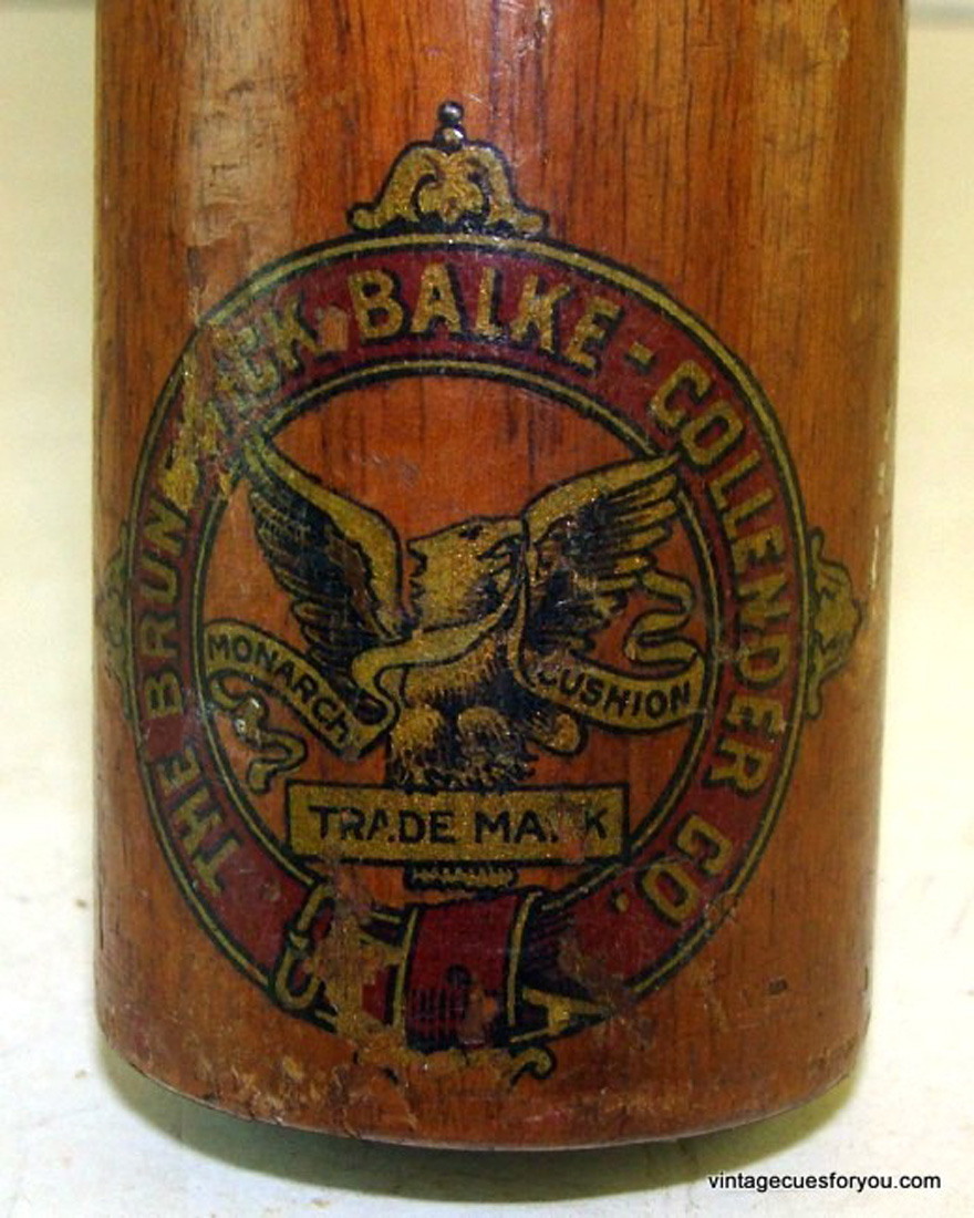
Sometime in the mid-1920s though I am not sure when, the Brunswick decal changed. I believe the decal in Pictures #14, and the two views of another cue in Pictures #15 and #16 are the next varnish-fix decals to be used on Brunswick-Balke-Collender Co. cues.
I will bet that when you looked at the two cue decals in Pictures #14 and the two views of another cue in Pictures #15 and #16 you saw the same decal. Not so quick. Look at the eagle’s eye in each decal. Picture #14 is a small eye with a line trailing to the left of the eye. The Picture #15 eagle looks to have gotten a black eye in a fight but no line trailing behind the eye. Compare the feathering in the legs of these two decals. Do they look the same to you? Wouldn’t it be nice to know “when” Brunswick went from the one design of what may look like the same decal to the other and why? If we knew that, we could then more correctly date the two cues that are shown below, not that the exact date of a cue is that critical to its value.
The decal in Picture #17 is the same eagle as the two views of the decal in Pictures #15 & #16. The only real difference is the color of the outer ring and perhaps the background color behind the eagle. One outer ring is gold and the other is an army green. The printer of my decals, who has been in business for 75 years is fairly certain the gold is actual gold dust in the lacquer. He feels Brunswick and that printer went to the green outer ring most likely because of the increasing cost of gold for the lacquer ink in the screen print process.
If all of this is adding to your confusion, let’s go a step further. The eagle in the decal in Picture #14 is the same design as the eagles in Picture #18 and the two views of the decal in Pictures # 19 and #20. Look, the outer ring in #14 and #18 are differing shades of gold and the outer ring and eagle in Pictures #19 and #20 are a shade of green rather than gold. I have had cues with original green ringed decals which are very bright green and others that are very pail army green. I wonder if this color difference is from ink that has faded over time or was it a different pigment use in screening the decal.
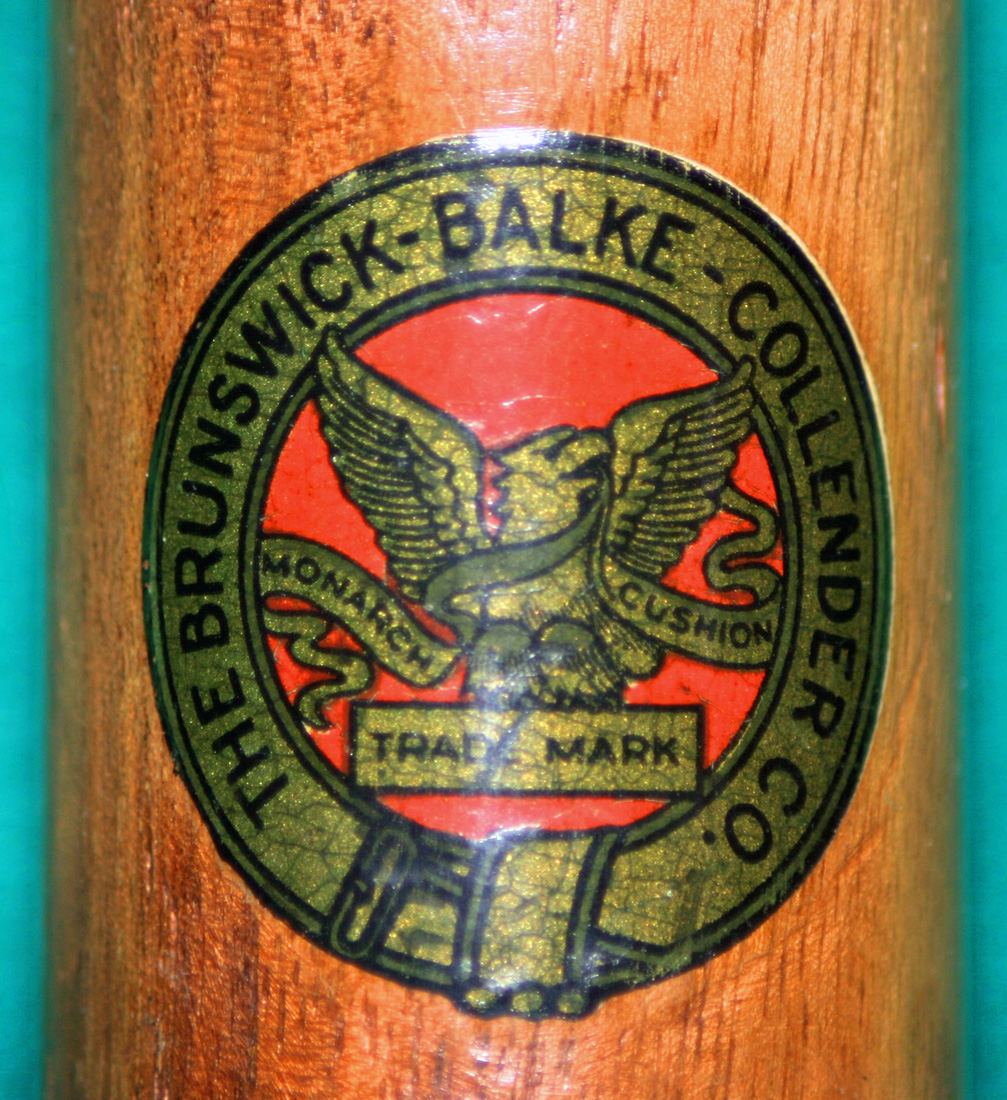
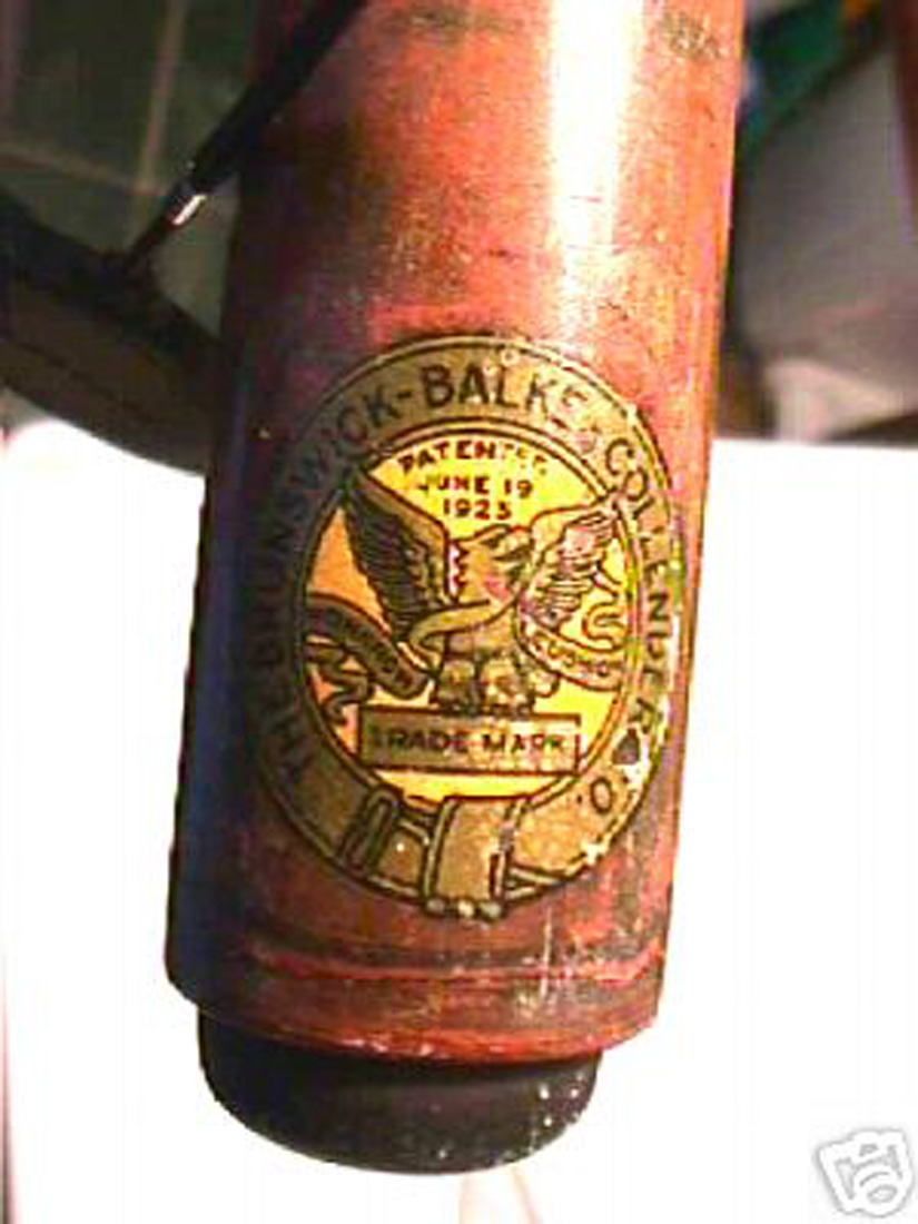
According to the Blue Book of Pool Cues, by Brad Simpson, the decal shown in Picture #14, and two views of the same decal in Pictures #15, and #16, were being used on Brunswick cues between 1921 and 1925. That is pretty definite timing don’t you think? The decal style in Picture #14 is very distinctive in that the decal no longer incorporates the bell-shaped design at the 1, 6, 9 and 12 o’clock positions of the decal with the red ring shown in Picture #13. As to the date when the decals changed, I am not sure. But one thing is for certain, the decal in Picture #21 is known. The decal actually has a date, “Patented June 19, 1925”. This cue does not have the bell-shaped design around the outer ring. I have yet to find another example of a cue with this decal. We can not even say this cue was made in 1925. It was made in a period from 1925 to 1942 since a patent is good for 17 years.
Perhaps you are confused or maybe you just do not care. Let’s add a bit of confusion as to the date when cue decals change on Brunswick cues by looking at Picture #22. The Bule Book says the red decal was used from 1906 to 1920. Look at the Let’s color fold out in the 1926 Brunswick Catalog. Here you see you still see the red decal with the bell shapes around the outer ring like the cue in Picture #13. If the Blue Book were correct this catalog should have a decal like that in Picture #20.
Further, look at the cue decals in Picture #23. The is the 1928 Brunswick color fold-out of Brunswick cues. Here is the original eagle from the early 1900s like the one shown Picture #3. However, the eagle is white and not gold and there are no bell shapes around the outer ring. I have never seen this decal on an actual Brunswick Cue. I say again, you cannot use pictures in a Brunswick catalog to get an exact date when your Brunswick cue was manufactured. These pictures in catalogs do not reflect the reality of when cues with certain decals were produce.
Don’t let anyone listing a cue on eBay tell you with certainty that they have a cue manufactured by Brunswick-Balke-Collender Co. in a particular year as evidenced by the type of decal applied in the factory. There are not enough records to say precisely when Brunswick used a particular decal. During the past 20 years, I have likely spent more time than most obsessing over the timing of these decals and the best I can say is: During the period from 1900 to 1940 Brunswick decals were applied to cues possibly in the order shown above, without being too specific about the date. All of these cues from this period were varnish-fix decals and not inaccurate, water slide decals that are now being sold by others.
BRUNSWICK-Balke-Collender Co.’s WILLIE HOPPE CUE DECALS:
While I have focused most of my attention on restoring antique cues of days gone by (1850 to 1940), I have found many people of my generation have a great interest in the restoration of Willie Hoppe cues. I suspect the 1950’s – 1960’s billiard players of my age held Willie Hoppe cues and the player, Willie Hoppe in the same regard as golfers of this era held Ben Hogan and the golf clubs that he sold. I have immersed myself in a study of the Willie Hoppe cue decals and how they have changed through time. I wanted to be certain that during the restoration process of a Willie Hoppe cue, a correct decal is applied where the original decal had previously been lost due to the poor water slide adhesive process used on these cues at the time.
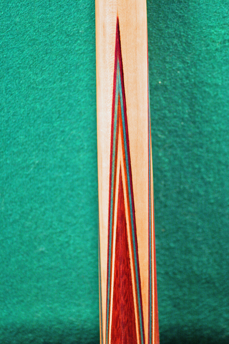
For twenty to thirty years in the early 1900’s Brunswick had been producing a very attractive cue with four multi-colored veneer Berger points. In general, these were referred to as Titlist points or 26 ½ cues. In 1940 Brunswick introduced the Willie Hoppe cue named for the world-famous carom billiard champion who had won 51 world titles between 1906 and 1951. The Willie Hoppe Cue had very attractive and distinctive, multi-color, veneer Berger Points also called Titlist points like those seen in Picture #24.
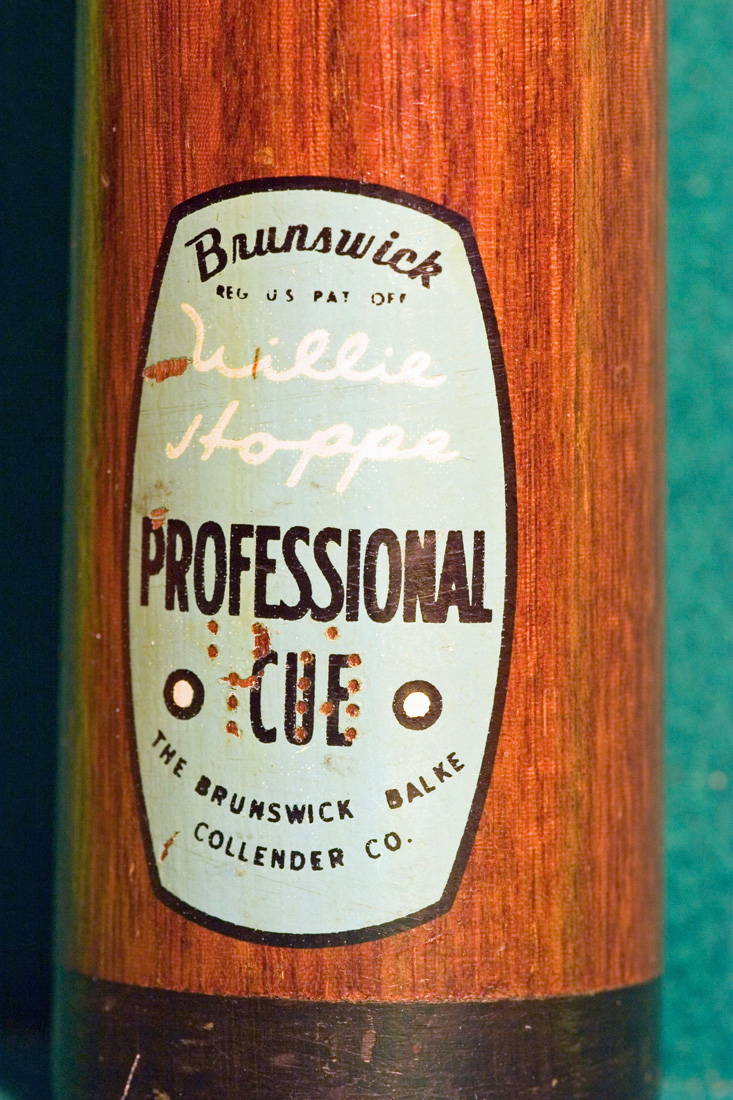
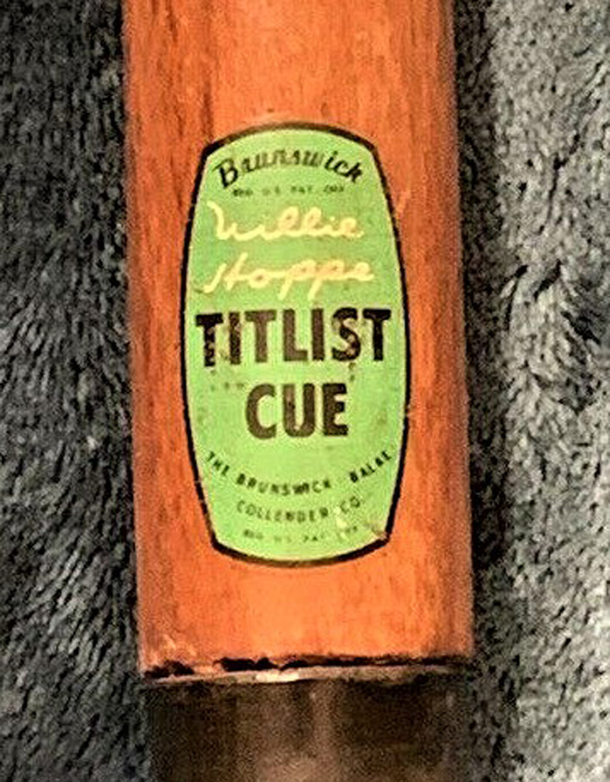
The Willie Hoppe cue came in two models; the two “piece”, “Willie Hoppe Professional Cue” and the one “piece” “Willie Hoppe Titlist Cue”. Decals for both of these first version on the Willie Hoppe cue are shown below in pictures #25, #27 and #28. In 1940, Brunswick for the first time used a water slide decal on its cue rather than a varnish fix decal. You will find a discussion of the differences “Varnish Fix decal and “Water Slide” decal in the Cue Decal Recreations section of this website. The simplicity of the water slide decal as well as the time and cost to apply it in the factory surely led to this production change. Notice the similarity of the font style for “Brunswick” and “Willie Hoppe” on both cues in Pictures #25 and #27. The difference will be apparent on later Willie Hoppe decals.
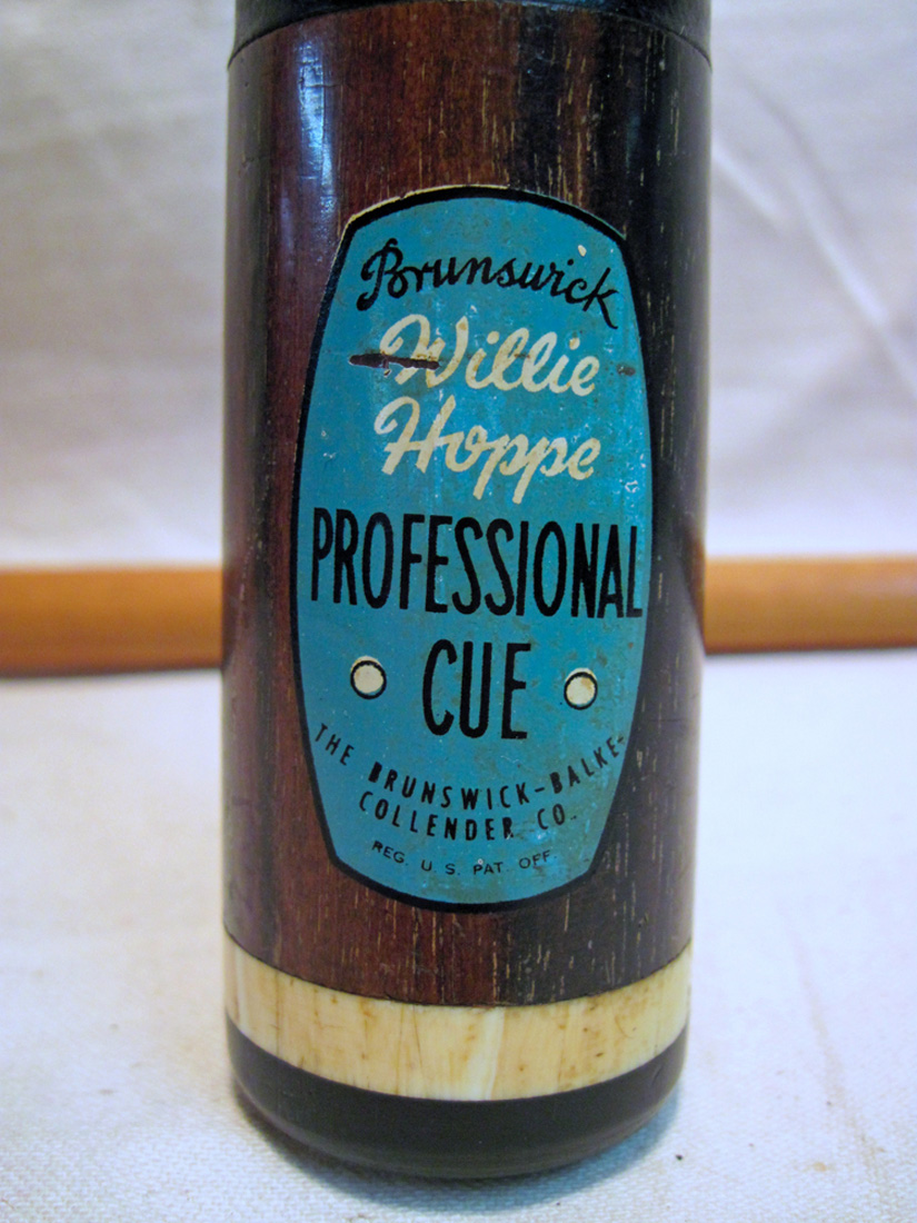
This first two piece “Willie Hoppe Professional” cue came with an ivory and black fiber butt cap as can be seen in Picture #25. The ivory ring is often called the Hoppe ring or Rambo ring since Herman Rambo created the Willie Hoppe cue for Brunswick. No Willie Hoppe Professional cue ever came with a rubber silencer on the butt. If you see one a Willie Hoppe cue it was added after it left the factory. A rubber silencer was not needed as the fiber butt is strong and protects the butt of the cue.
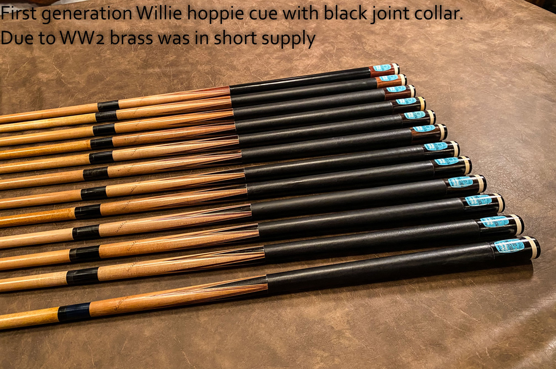
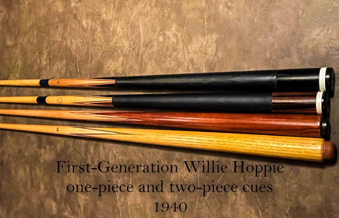
The first-generation Willie Hoppe professional cue produced in 1940 is very distinctive. Herman Rambo the famous cue maker worked for Brunswick off and on from when he was 14 years old in 1894 until 1950 when he retired and began making cues in his own shop. Herman Rambo made the first Hub cue, and a cue with titlist points that we see on cues which are often referred to as Brunswick style #26 ½. (See Picture #24) Herman Rambo is credited with designing the first two-piece Willie Hoppe cue for Brunswick in 1940. These Rambo, Willie Hoppe cues are shown in Picture # 26. This cue is different from other Willie Hoppe cues made later. Brass was in short supply due to the World War 2. Rambo’s design for this first two-piece Willie Hoppe cue included a steel pin in the butt and a steel sleeve in the shaft giving the joint added strength. The first Willie Hoppe cue also had a black fiber joint collar rather than the brass joint collar that would come on future Willie Hoppe production models. If you have one of these first-generation Willie Hoppe Professional cues you can say you have a Herman Rambo cue designed for Brunswick.
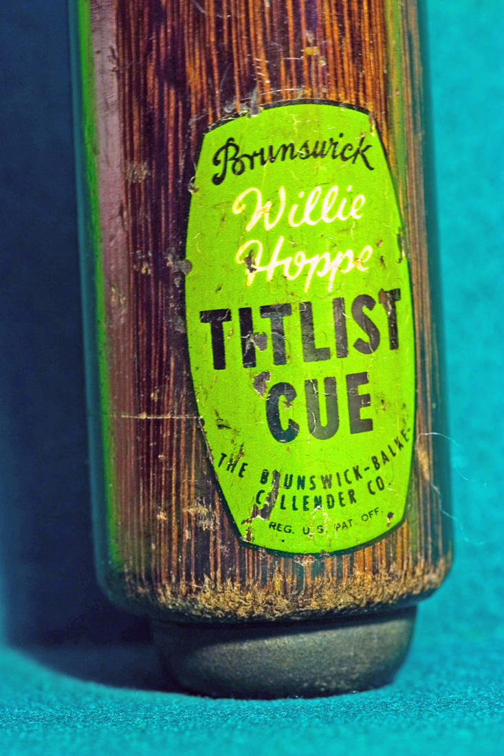
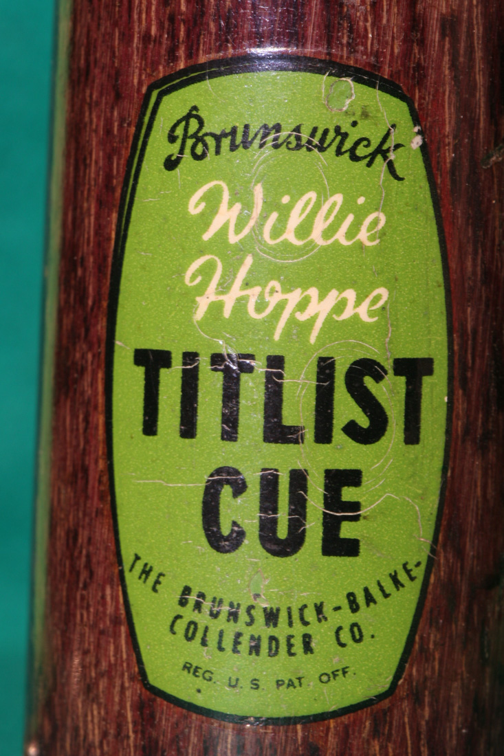
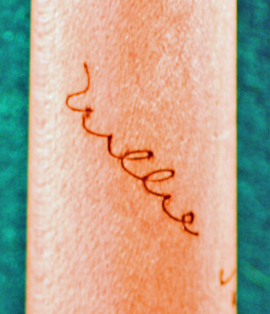
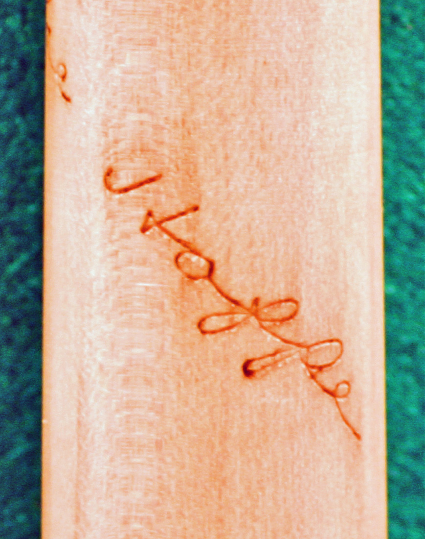
There is also a Willie Hoppe signature on the forearm of the Willie Hoppe cues which also helps in dating these cues. The Willie Hoppe signature on the forearm of the first Willie Hoppe Professional and the Titlist cue is shown in Pictures #29 and #30. Note that the two “i” s in Willie are dotted. Look also at the “H” and the “p” in Hoppe as they are different from the same letters in a second version of the Willie Hoppe forearm signature. The letter “p” on this cue has a sweeping, open tail.
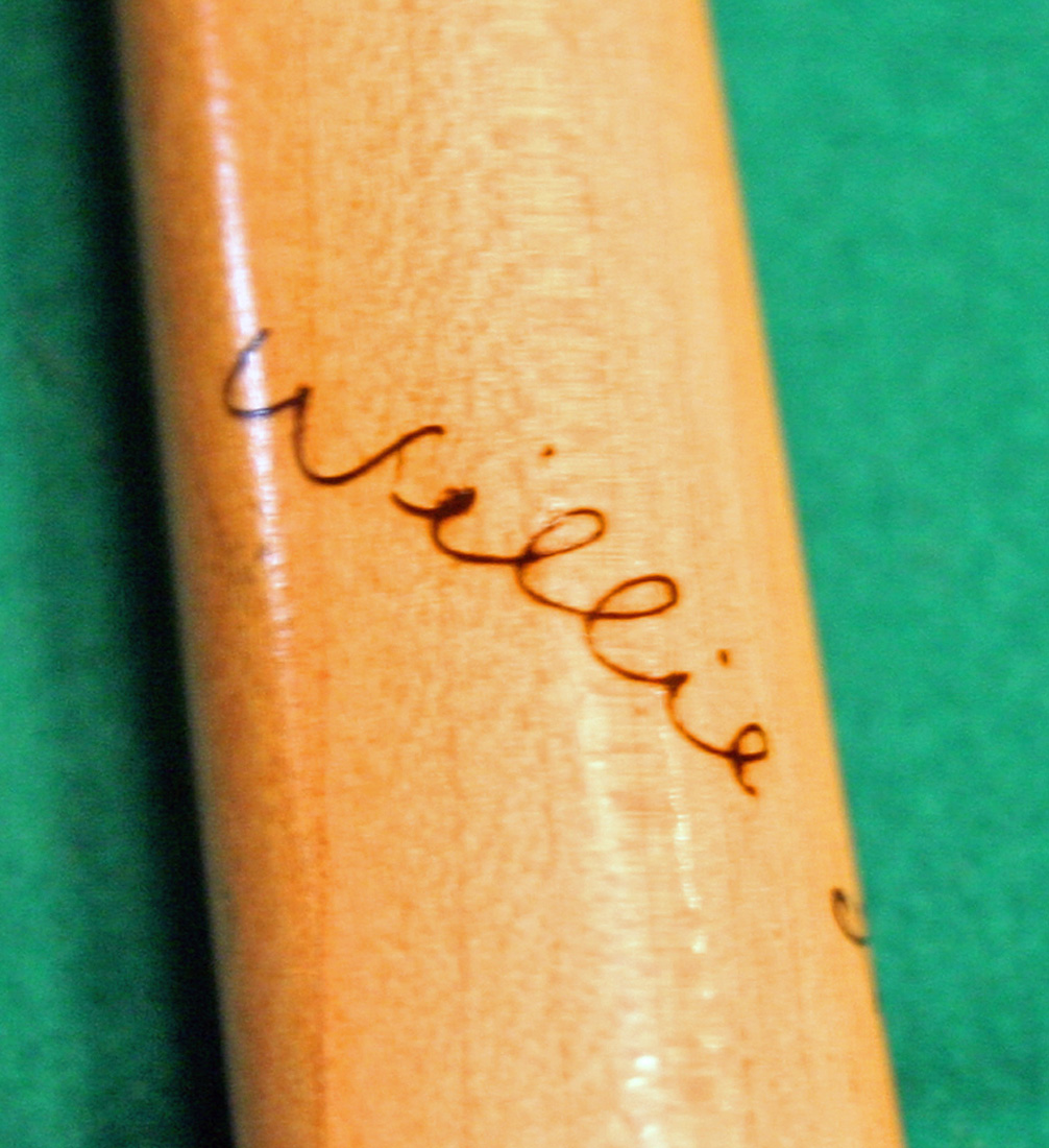
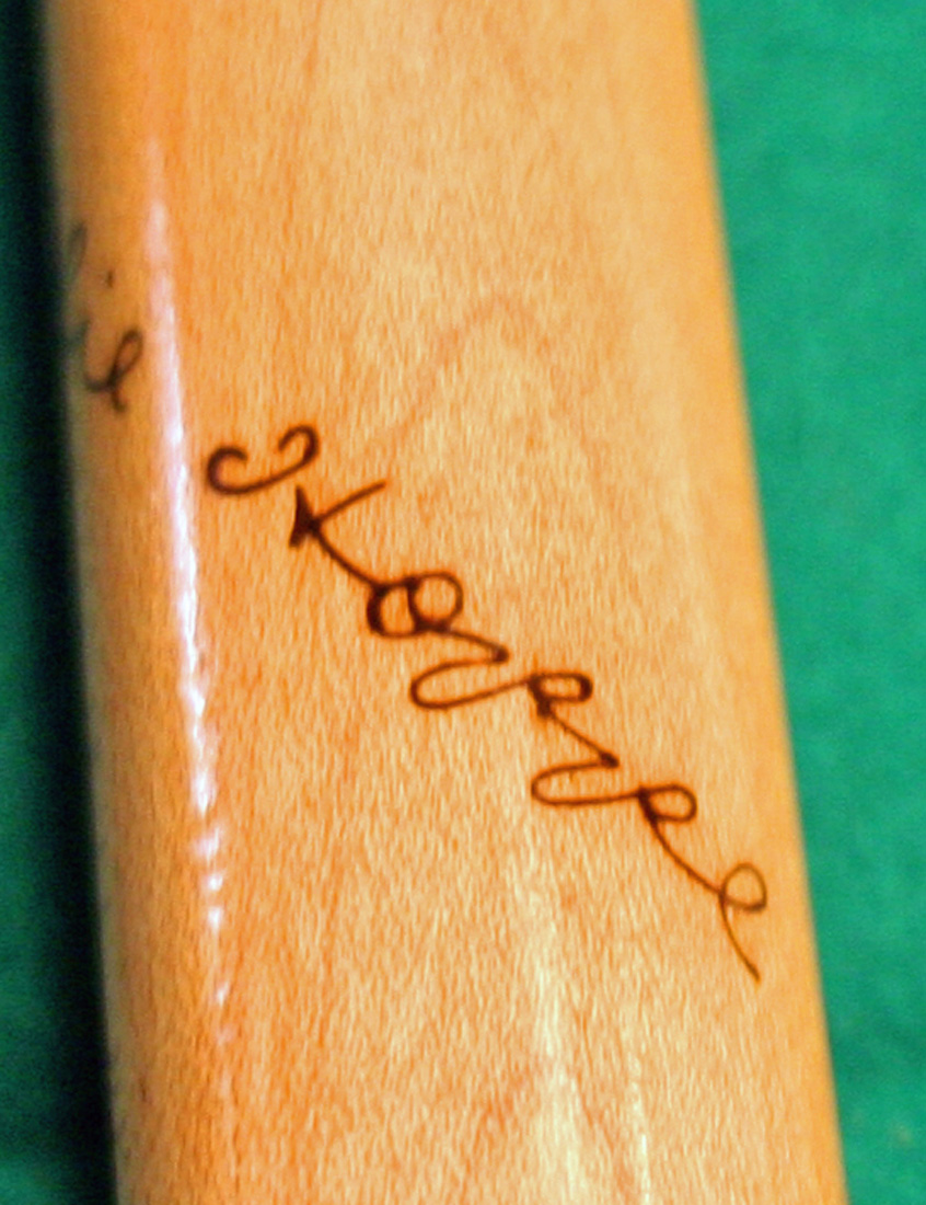
Most people believe that the forearm signature in pictures #29 and #30 is the only signature used on the forearm of the first (early 1940’s) vintage Willie Hoppe cue decal shown in Pictures #25. Picture #31 is another Willie Hoppe first generation decal but it has a brass pin, sleeve and joint collar. While this cue has the first generation decal it has a different forearm signature than the signature in #29 and #30.
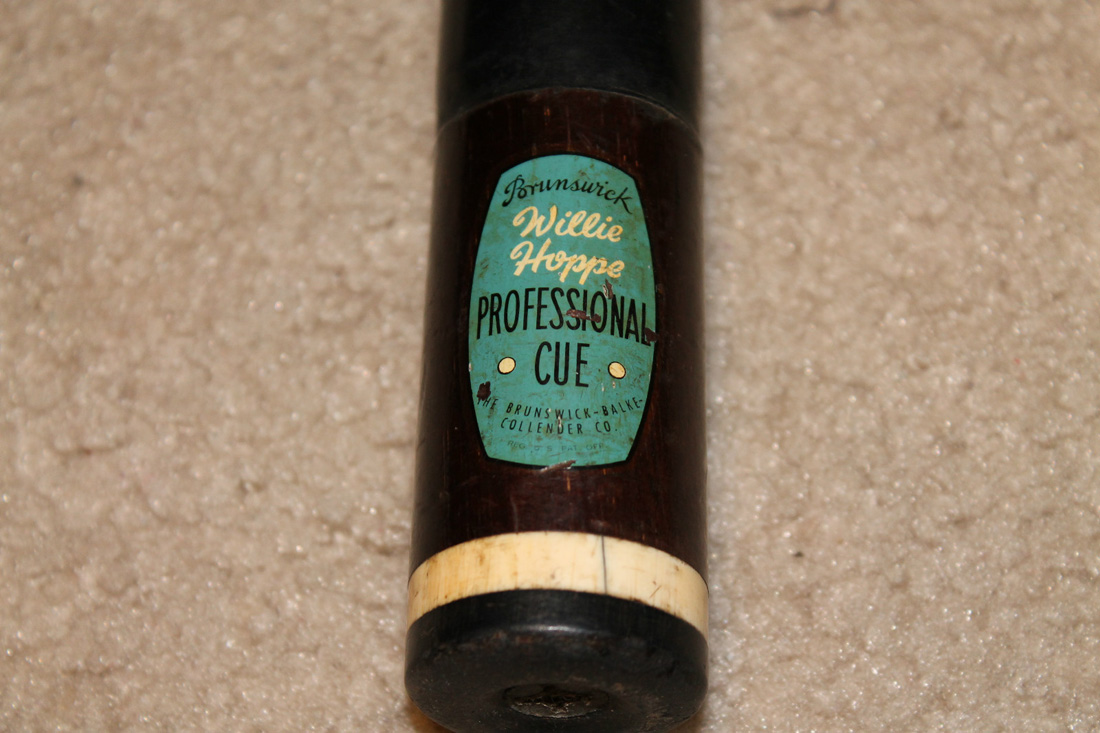
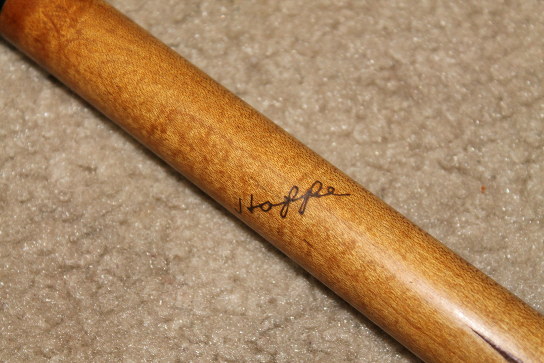
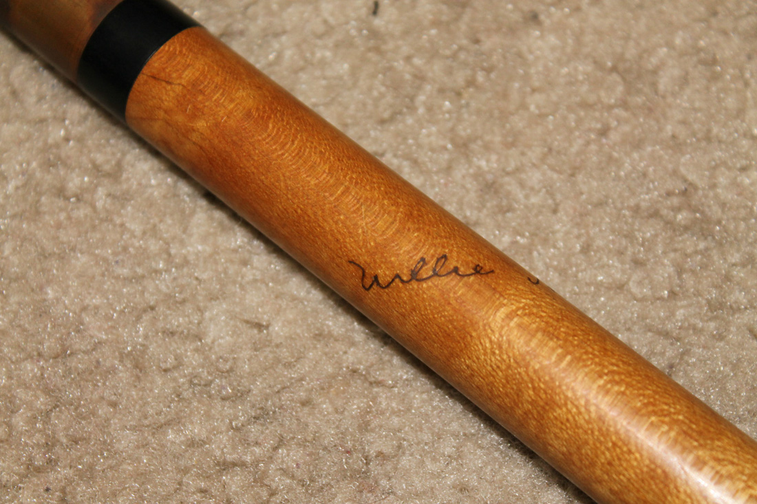
Picture # 34 and # 35 is an even better look at the second Willie Hoppe forearm signature. Notice this second signature does not have the “i” dotted in Willie like the one in Picture #29. Also notice in Picture #35, the different “H” and “p” in Hoppe of this second signature from the signature in the first-generation signature in Picture #30.
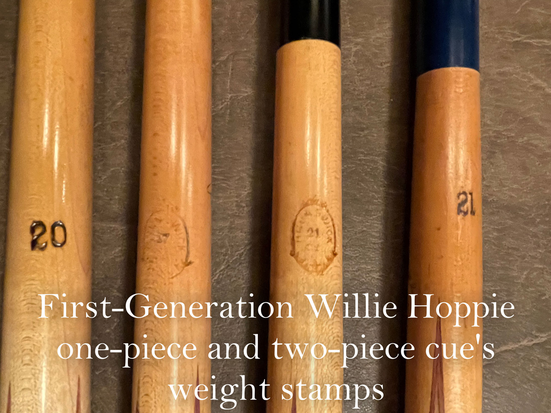
The weight stamp is one more thing that can further define the date of manufacture for a Willie Hoppe cue. Herman Rambo also invented the use of an internal weight stamp on Willie Hoppe cues to give proper balance to the cue. Some woods like ebony are very heavy and other woods such as ash are light in weight. Did you ever wonder how these two woods could have the same weight stamp? The cues with the ash wood butt have an internal metal rod place in the handle at the proper distance from the butt to give proper weight and balance. You could order a Willie Hoppe cue from Brunswick and specify both the wood and the weight.
Picture #36 is first-generation Willie Hoppe cues with decals like those in Picture #25 and #27. They have the first Willie Hoppe signature like those in Picture #29 and #30. Now look at Picture #37 for these same cues. You see two different weight stamps. The outer two cues are the style of weight stamp you see on most Willie Hoppe cues. The two center Willie Hoppe cues have a shield with Brunswick printed inside the shield and inside that is the weight stamp. These two center cues are the first and the rarest of all Rambo Willie Hoppes. We can definitely say these two cues were made at the beginning of 1940. I expect this weight stamp was too hard to read and too hard to apply and thus during that same year the bold number weight stamp came into being. Interestingly you will see this weigh stamp used again at a much later date.
I have restored a number of cues with the first-generation Willie Hoppe decal but with the second forearm signature like that seen in Pictures #31, #32, and #33. I expect that it was late in the production cycle for the first Willie Hoppe Cue, with the decal shown in Pictures #25 and #27, when Brunswick made the change to the forearm signature shown in picture #34 and #35. Also, all of the very first-generation Willie Hoppe cues with the black fiber joint collar shown in Picture #26 have the first-generation forearm signature see, in Pictures #29 and #30. Never have I seen a first-generation Willie Hoppe cue with the black fiber joint collar and the second- generation forearm signature.
The Willie Hoppe decal used on cues has changed several times since the first decal in 1940. To my knowledge, only the first early 1940’s version of the decal is found on cues with either one or the other of the two different forearm signatures. The forearm signature has remained the same as the one shown in Pictures #34 and #35 on all subsequent Willie Hoppe decals that include a forearm signature. If you, the reader, have evidence that this is incorrect please share your information with me and I will make changes to this website. All of these cues have a weight stamp that is opposite of the signature on the forearm.
Somewhere near 1945 and for the next 5- or 6-years Brunswick came out with a second two-piece, “Willie Hoppe Professional” and one-piece Willie Hoppe Titlist Cue with a new version of decal as seen in Pictures #38 and #39. Compared to the earlier version of the decal, you can see changes to the font style (example, compare the “B” in Brunswick) used as well as placement, size and style of the Willie Hoppe signature in the decal. Notice also the dot (circle) on either side of the word “Cue”. This is the only one of four Willie Hoppe blue decals where the center of the dot on either side of the word “CUE” is not white in color like the decal in Picture #25. These one-piece and two-piece Willie Hoppe cues, as well as all future cues with a Willie Hoppe forearm signature, are like the ones shown in Pictures #34 and #35. The shade of blue used in the silk screen process changes from one version of the Willie Hoppe decal to another. This second version of the Willie Hoppe cue still had the ivory Hoppe ring as part of the butt cap. I guess since Herman Rambo retired in 1950, at the time this cue came out you could longer call the ivory ring a Rambo ring.
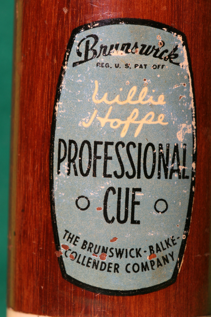
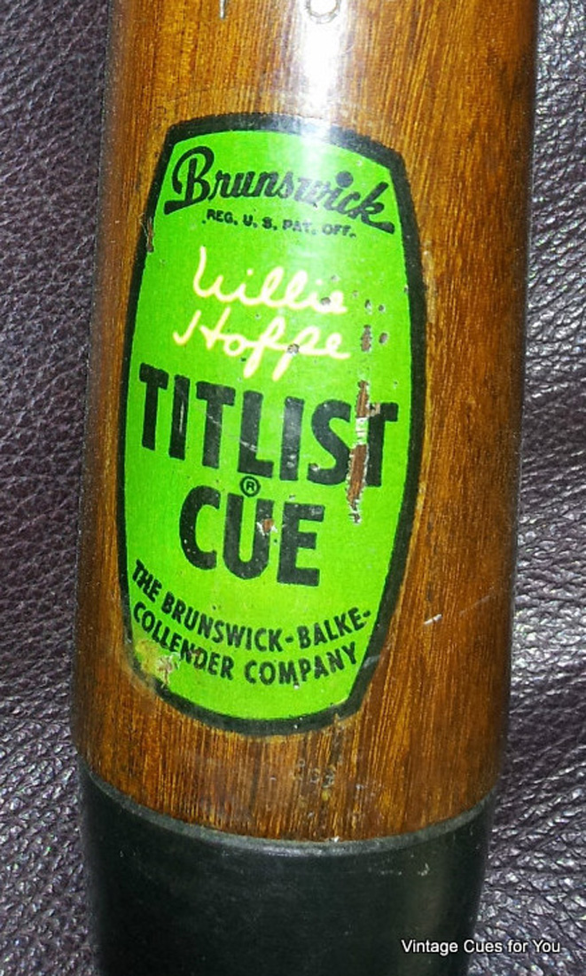
Starting at about 1951 and for the next ten years the Willie Hoppe Professional and the Willie Hoppe Titlist cue had a decal like that shown in Picture # 40 and 40a. Again, notice the change in font style (check the “B” in Brunswick. The “W” in Willie Hoppe signature on the decal almost touches the “B” in Brunswick. If that isn’t enough to convince you there are differences, check the open lower loop in the first “P” in Hoppe. The ivory Hoppe ring is gone from the butt cap on these 1951 and later cues. My guess is cost of ivory and concerns for the preservation of the elephant prompted this change much like Brunswick discontinued selling ivory billiard balls. The forearm signature is the same as Pictures #34 and #35. All of these cues have a weight stamp that is opposite of the signature on the forearm and bold like the outer cues in Picture #37.
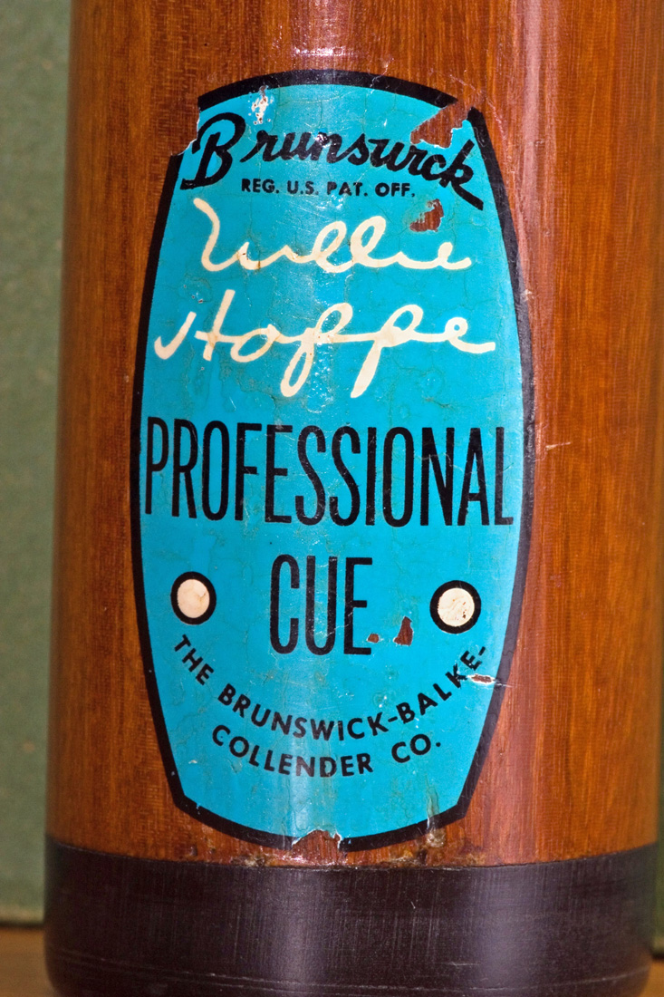
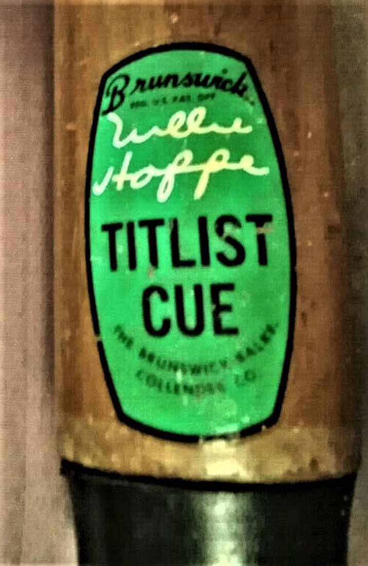
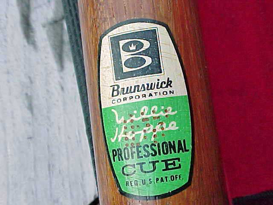
While I do not have a date certain, let’s say for most of the 1960’s, Brunswick came out with a fourth version of the “Willie Hoppe Professional” decal and one-piece Willie Hoppe Titlist as shown in Pictures #41 and #41a. I am certain that if you have followed the discussion thus far you can pick out for yourself the different font style, placement of signature and shade of blue from earlier Willie Hoppe Professional decals. On some of this style of decal and on later Brunswick cues that had decals, you will also notice a perforation in the decal. My guess is the perforation was an indication of the production date of the cue. If you have a more definitive idea as to why the decal is perforated let me know and I will update this web page. Again. there is no ivory Hoppe ring and the forearm signature is like that in pictures #34 and 35. All of these cues have a weight stamp that is opposite of the signature on the forearm
I cannot give you the dates when changes were made but for certain sometime in the 1970s, the Willie Hoppe decal changed to the ones shown below as these are the last two Willie Hoppe cues and decals used by Brunswick. In order of use is the decal in Picture #42 and then the decal in Picture #43,
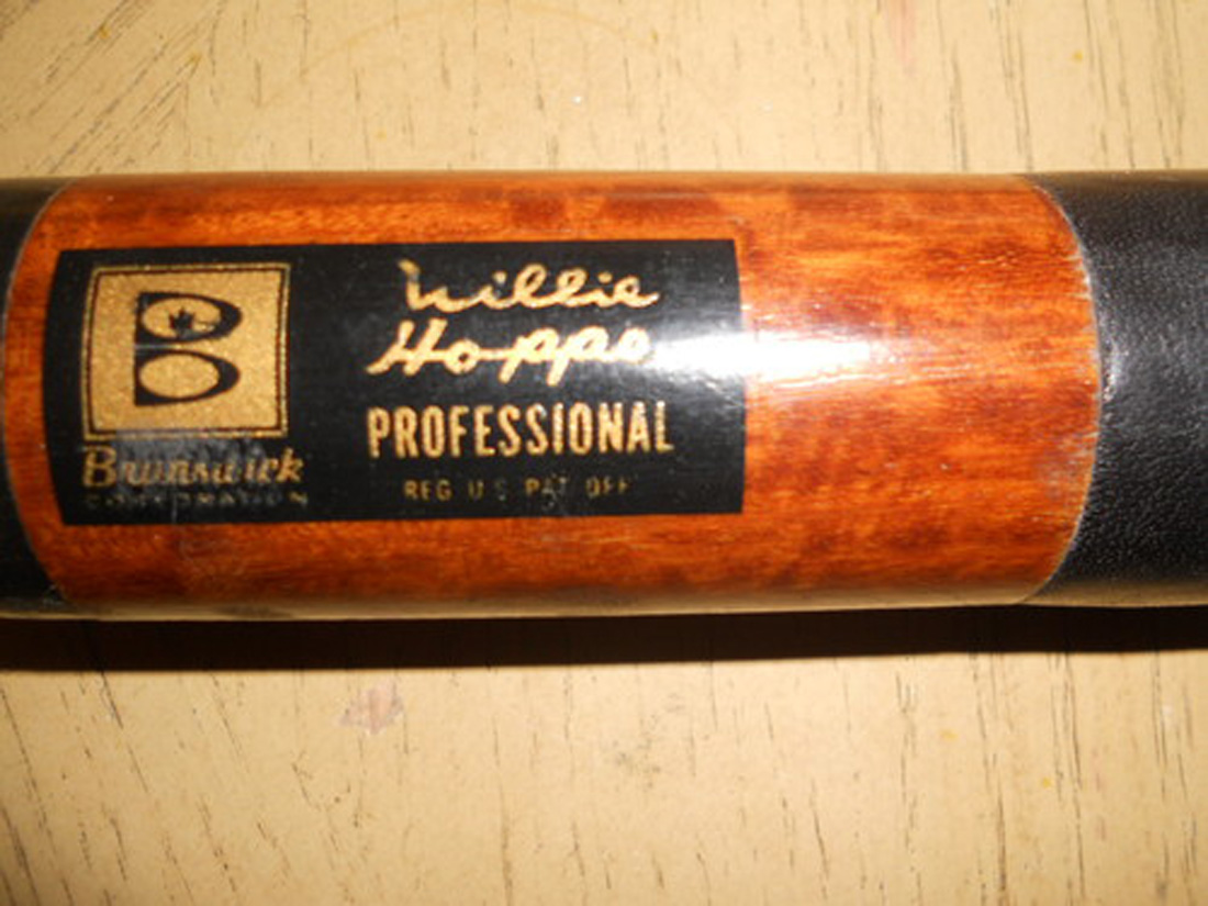
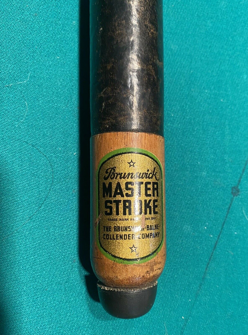
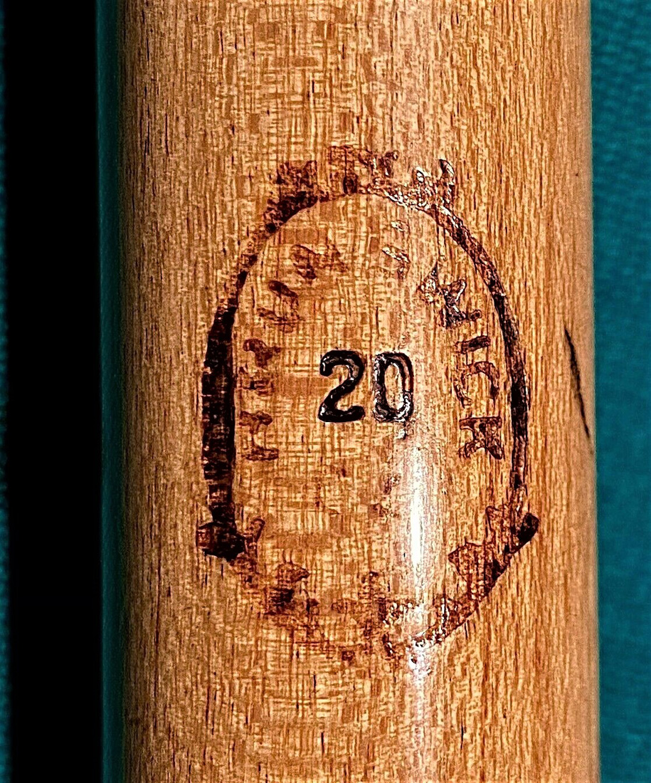
The Brunswick Master Stroke replace the Willie Hoppe cue in the 1970s. This cue is very similar to the two-piece Willie Hoppe Cue in construction but without the veneered Berger points. In Pictures #44 and #45 you see the decal and the weight stamp for the Master Stroke. I find it interesting that after more than 40 years Brunswick was once again is using the weight stamp like that of the first-generation Willie Hoppe seen in Picture # 37.
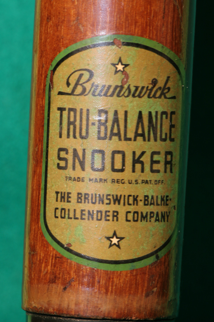
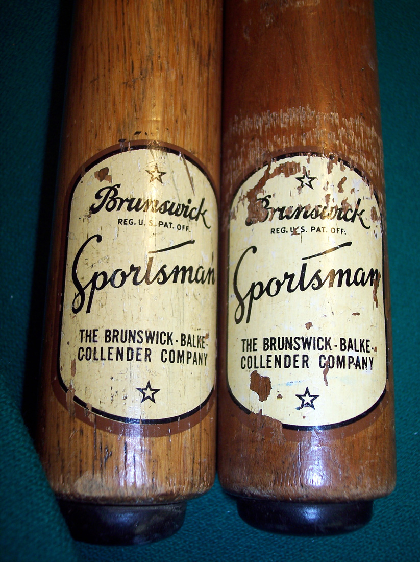
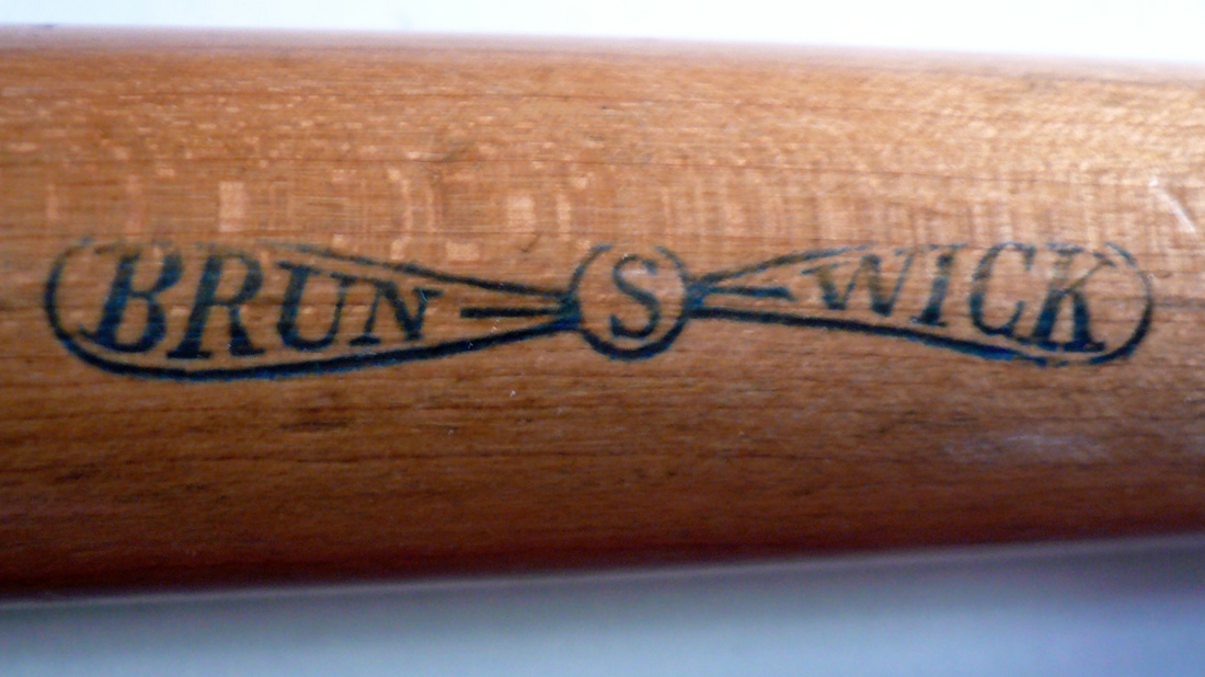
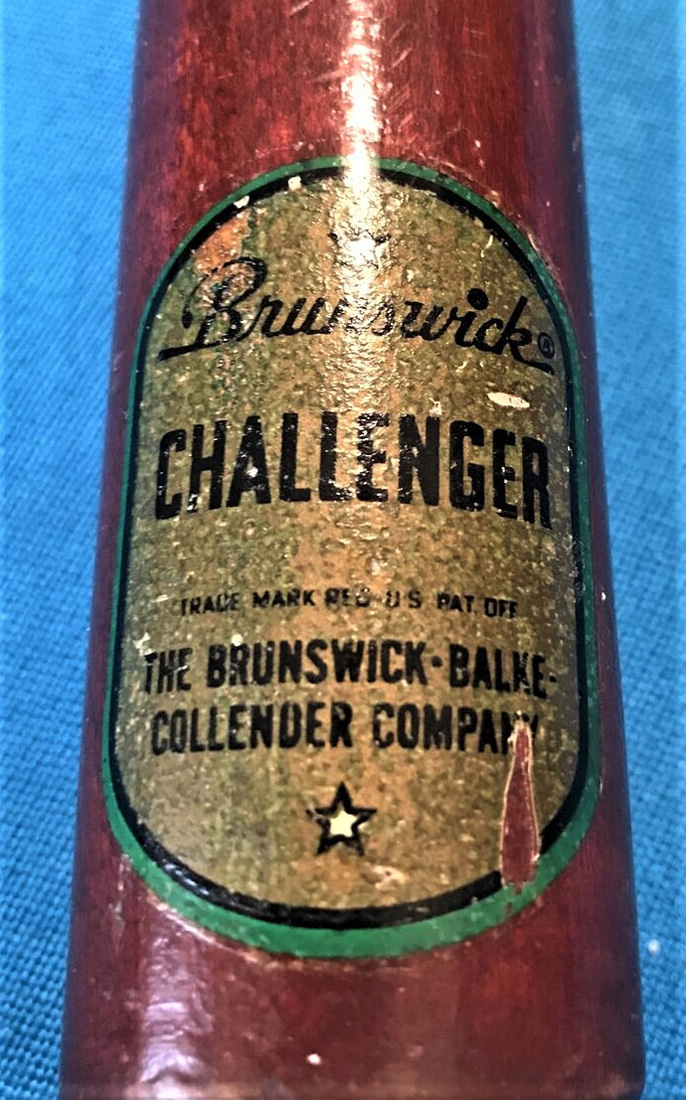
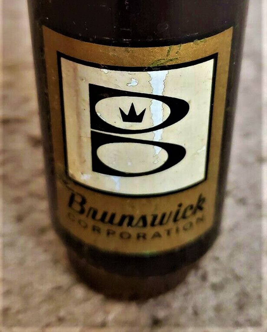
While far from complete, I have included five other decals or stamps used by Brunswick as seen below. Unfortunately, I do not have enough information to explain when these cue decals were used. If you have pictures of other Brunswick decals and would care to send me a picture, I will add your decal pictures to this page of the website. If you have read and followed all of this in depth, detailed discussion, I congratulate you. You are as possessed as I am.
